Here's a statement of the obvious: The opinions expressed here are those of the participants, not those of the Mutual Fund Observer. We cannot vouch for the accuracy or appropriateness of any of it, though we do encourage civility and good humor.
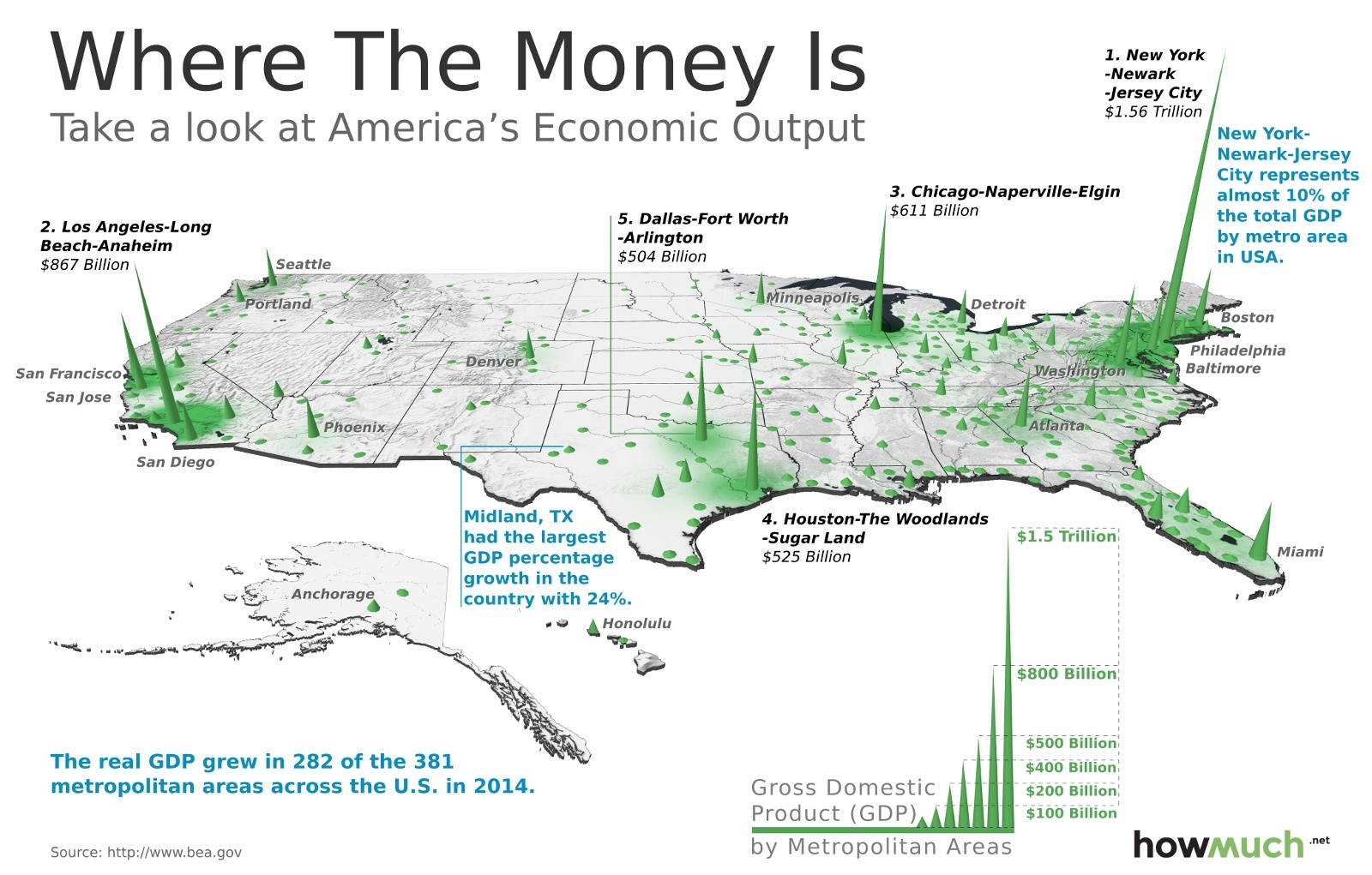
"We built a map to provide a 3D visualization of the GDP by metropolitan area, seen below. The higher the cone rising out of the map, the greater the GDP in that area. In analyzing the data, we found that the top 20 metropolitan areas represent over 52% of the total GDP in the United States."


Comments