Category Archives: Charles

Fairholme Fund (FAIRX) – What a Difference a Decade Makes

By Charles Boccadoro

From the Mutual Fund Observer discussion board, July 2013

FAIRX by the numbers…

First 3.5 years of 2000’s:

1_2013-07-15_0841

First 3.5 years of 2010’s:

2_2013-07-15_0952

What strikes me most is the difference in volatility. Superior excess returns with lack of downside volatility is what I suspect really drove Fairholme’s early attention and attendant AUM, once nearly $20B.

Here are the numbers from its inception through 1Q2007, just before financials popped (a kind of preview to my assignment for Mr. Moran):

3_2013-07-15_1014

Even through the great recession, FAIRX weathered the storm…fortunately, for many of us readers here on MFO. Here are the decade’s numbers that helped earn Mr. Berkowitz Morningstar’s top honor:

4_2013-07-15_0902

Pretty breathtaking. In addition to AUM, the success also resulted in Fairholme launching two new funds, FAAFX (profiled by David in April 2011) and FOCIX.

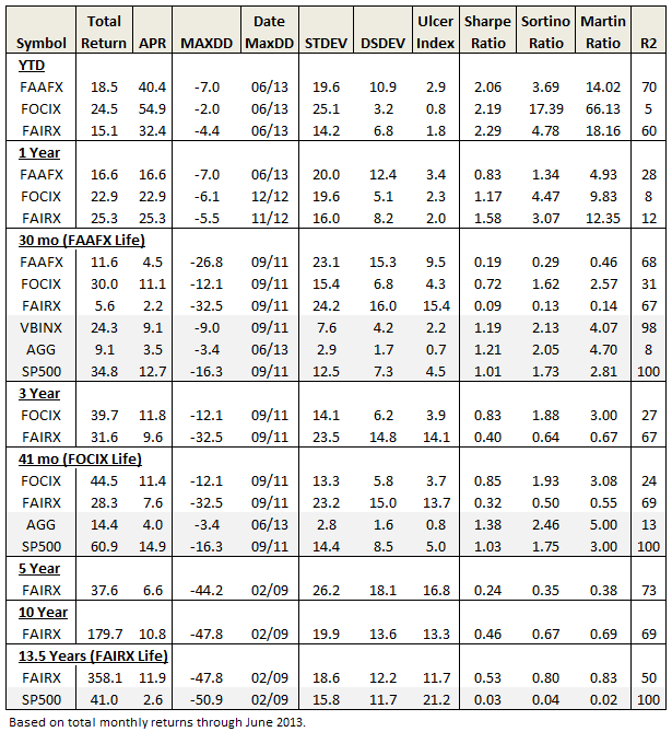
Here is table summarizing Fairholme family performance through June 2013:

5_2013-07-15_1033

Long term, FAIRX remains a clear winner. But investors have had to endure substantial volatility and drawdown this decade – something they did not experience last decade. It’s resulted in extraordinary redemptions, despite a strong 2012. AUM is now $8B.

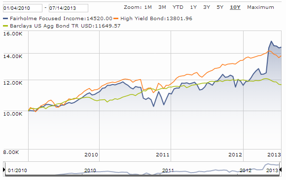
The much younger FOCIX tops fixed income ranks in absolute returns, but not risk adjusted returns, again due to high volatility (granted, much of it upward..but not all). The fund bet heavy with MBIA and won big. Here’s current Morningstar performance plot:

6_2013-07-15_0935

And FAAFX? About all we shareholders can say is that it’s beaten its older brother since inception, which is not saying much. Below market returns at above market volatility. (I still believe it misplayed its once-heavy and long-term holding in MBIA.)

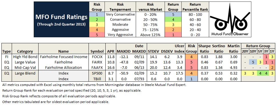
Here are latest MFO ratings for all three Fairholme funds:

7_2013-07-15_1035

None are Great Owls. Yet, if I had to bet on one fund manager to deliver superior absolute returns over the long run, it would be Bruce Berkowitz. But many of us have come to learn, it’s gonna be a bumpy ride. Like some other deep value money managers, he may simply look beyond risk definitions as defined by modern portfolio theory…something fans of Fairholme may need to do also.

Here is link to original thread.

Timing Method Performance Over Ten Decades

By Charles Boccadoro

Originally published in July 1, 2013 Commentary

The Healthy Debate. In Professor David Aronson’s 2006 book, entitled “Evidence-Based Technical Analysis,” he argues that subjective technical analysis, which is any analysis that cannot be reduced to a computer algorithm and back tested, is “not a legitimate body of knowledge but a collection of folklore resting on a flimsy foundation of anecdote and intuition.”

He further warns that falsehoods accumulate even with objective analysis and rules developed after-the-fact can lead to overblown extrapolations – fool’s gold biased by data-mining, more luck than legitimate prediction, in same category as “literate monkeys, Bible Codes, and lottery players.”

Professor Valeriy Zakamulin cites Arson’s book when examining Mebane Faber’s 2007 seminal study of a simple moving average timing strategy. Using data since 1900, Faber found the method delivers equity-like returns with bond-like volatility. But Zakamulin’s recent study concludes:

  • Reported performance of these market timing strategies contains a substantial data-mining bias.
  • Over a sufficiently long run there are no chances that the market timing strategy allows investors both to reduce risk and enhance returns.

In other words, just because the strategy worked in last hundred years, does not mean it will work in next hundred years. A hundred years! “There is no simple and magic formula in finance that allows you to easily beat the market in real life,” politely explains Professor Zakamulin in response to my inquiry.

But what about the “Magic Formula” investing strategy? One cannot find a simpler strategy. And it was developed by Joel Greenblatt – a professor at Columbia University.

Actually, academic and investment communities alike do seem to frown on timing strategies, often recommending a passive buy-and-hold approach instead. Many advisors discourage attempts to beat the market, since very few succeed and over time the market does pretty well – no need to try and beat it. Wiser instead to invest in low-fee index funds of risk levels commensurate with your temperament and investment time horizon.

faces

Risk, it seems, is one of few predictors considered legitimate. Indeed, in the 1960s, Jack Treynor and Professor William Sharpe quantified how riskier investments can be expected to deliver higher returns.   Then, in the 1990s, Professors Eugene Fama and Kenneth French refined the correlation to show how investments in value and small cap stocks can also be expected to deliver higher returns – but again, because of their higher inherent risk.

As for other champions of timing or trend-following as a legitimate predictor? Perhaps closest support comes from Professors Narasimhan Jegadeesh and Sheridan Titman in their studies of momentum. Basically, stocks that have done well the past few months will continue to do well for the next few months. Perhaps an uncovered inefficiency and behavioral aspect of the market? Or, a well intended but ultimately futile result of data-mining bias?

After finding ubiquitously abnormal returns generated by value and momentum, Clifford Asness with Professors Tobias Moskowitz and Lasse Pedersen simply leave the proof to the reader – its justification “a challenge for future theory and empirical work to accommodate.”

The Accessible Data. Faber references Global Financial Data (GFD) for historical returns. A subscription to GFD is available for a mere $5,000 a year, outside the reach of most individual investors. Fortunately, Professors Amit Goyal, Robert Shiller, and others maintain historical databases on freely accessible websites, which include S&P price, dividends, bond returns, 3-month T-Bill rates, and more.

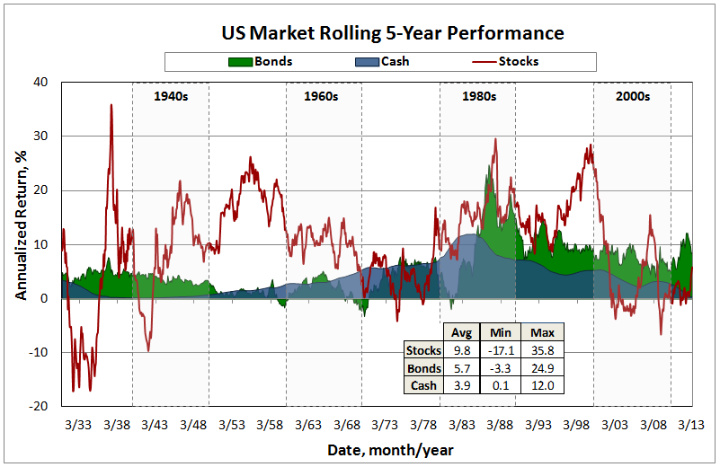
Using data since 1926, just before the great depression, the following chart presents rolling 5-year returns of US market performance – a sort of big picture view. Plotted are annualized returns for cash (3 month T-Bill), bonds (long government), and stocks (SP500 total). Note that to form total return, dividends are incorporated into stock price returns prior to 1970. Returns prior to 1972 for bonds, 1970 for stocks, and 1962 for cash are from the Goyal and Shiller websites. All subsequent returns are from the Morningstar database found in Steele Mutual Fund Expert.

us market

Besides the obvious volatility differences between each investment vehicle, other observations include:

  • The depression years were horrible for stocks. Far worse than anything experienced since.
  • The post WWII period produced two decades of exceptional stock returns. Followed by two more decades of exceptional returns in the 1980s and 1990s, a period bookended by Presidents Ronald Reagan and Bill Clinton. The recent run-up in stocks pales in comparison, so far anyway.
  • Cash returns via CDs and money markets exploded in the 1980s. The current zero rate environment was last experienced in the early 1940s.
  • Since 1980s, bonds have been the vehicle for consistently healthy returns, hands-down. Very recently, however, this bull has turned bearish.

The Extraordinary Results. Employing the 10-month simple moving average timing method (10-mo SMA) to these data over ten decades reveals impressive performance, reiterating the conclusion documented by Faber and delighting AKAFlack, an MFO reader who champions the strategy.

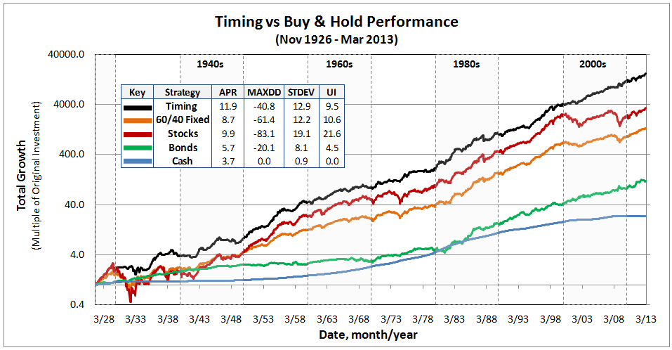
The timing method is based on monthly returns. If stock price ends the month above its 10-mo SMA, the method is all-in stocks the following month. If it is below, the method is all-in bonds. Here is a comparison of returns for timing, 60/40 fixed stocks/bonds (so-called balanced fund allocation), pure stocks, bonds, and cash strategies. Note the growth axis is logarithmic in order to get appreciation of behavior over time given the large magnitude changes involved.

An embedded tabulation summarizes for the total period of 86.4 years: annualized percent return (APR), maximum draw down percent (MAXDD), annualized standard deviation percent (STDEV), and Ulcer Index percent (UI).

performance

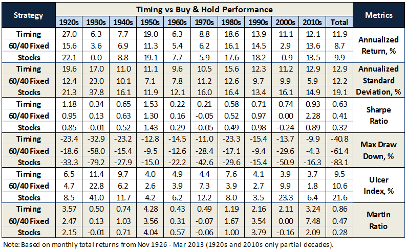
To get a sense of performance across each decade, the table below compares key metrics. Timing generally delivers higher absolute and risk adjusted returns while better mitigating draw downs than either fixed strategy of 60/40 stocks/bonds or pure stocks. Not always, of course, as seen previously in MFO Discussion 10 mo SMA Method In Down Markets. Timing’s vulnerability is sudden descents and ascents, lasting about half the averaging period, five months or less in this case. It performs strongest when the trends are extended, like during the great depression and recession.

strategy-metrics

In the recent words of Peter Martin, inventor of Ulcer Index, simple timing systems “normally regarded as having little value – actually have a much higher risk-adjusted performance than a buy-and-hold strategy…and are quite effective at avoiding long, deep draw down.”

A few other statistics for the record:

  • Of the 1037 months evaluated, timing was all-in stocks 686 months, or 66% of time.
  • It switched between stocks and bonds 123 times. In another words, it turned-over 12% of time.
  • The average draw down at time of switching from stocks to bonds was -10.9%, while the median was -8.8%.
  • Timing delivered higher returns than the 60/40 fixed strategy 78% of the 988 rolling 5-year periods examined in the database spanning ten decades.   

Faber finds that trend-following delivers similarly impressive results across multiple investment vehicles. “In lots of markets,” he says, “not just one…it works in almost all of them!”

25 June 2013/Charles

Anecdotal Long-Short

By Charles Boccadoro

Originally published in July 1, 2013 Commentary

ls-faces

In Andy Kessler’s book “Running Money,” he describes the following conversation with an interested investor just after his fledgling Velocity Capital hedge fund starts to attract some healthy attention:

“What percentage of your fund is short?”

“None,” I answered.

“You guys don’t short?” he asked almost incredulously.

“No. We never have.”

“But why not?” he asked.

We had been asked this question a million times.

“Well, there is an unlimited potential for loss.” This means that if the stock keeps going up, you have to buy it back at much higher prices. Imagine shorting Microsoft in 1986.

“And any gains are short-term gains taxed at twice the rate as long-term capital gains,” I added.

“OK, fair enough, but…”

“And you can only make 100.”

“Excuse me?” he asked. It was a flippant answer but the only real one.

“Sure. We like to spend our time finding things that go up by 5 times or 10 times. If we spend our time finding shorts, the most you can make is 100 and only if the stock goes to zero.”

“So you’re not hedged?” he asked.

“We think our hedge is to avoid the losers,” I said.

Mr. Kessler was in search of the “ten bagger,” a term coined by Peter Lynch, famed Fidelity Magellan PM from 1977-90. It represents a ten-fold increase in stock return. In baseball talk, it is the number of bases passed (aka “bagged”) while playing the game, or in this case, the equivalent of two home runs and a double.

Here is retired Mr. Lynch during a PBS interview describing how the “ten bagger” should play into an investor’s strategy:

“You don’t need a lot in your lifetime. You only need a few good stocks. I mean how many times do you need a stock to go up ten-fold to make a lot of money? Not a lot. You made ten times your money.”

“I think the secret is if you have a lot of stocks, some will do mediocre, some will do okay, and if one or two of ’em go up big time, you produce a fabulous result.”

“Some stocks go up 20-30 percent and they get rid of it and they hold onto the dogs. And it’s sort of like watering the weeds and cutting out the flowers. You want to let the winners run.”

“So that’s been my philosophy. You have to let the big ones make up for your mistakes. In this business if you’re good, you’re right six times out of ten. You’re never going to be right nine times out of ten.”

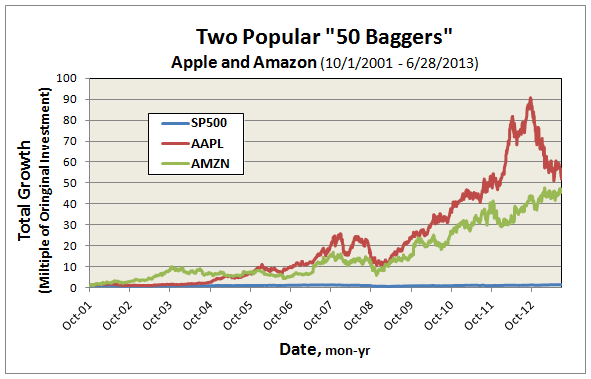
Here are a couple recent examples we should all be familiar with:  An investment in Apple AAPL or Amazon AMZN on October 1, 2001, less than 12 years ago, has produced returns of 40% annually. Each has multiplied original investment about 50 times, or 12 home runs and a double. What does a 50 bagger look like? Here, in comparison with SP500:

ls-50baggers

Can you imagine shorting Apple? Well, actually, DoubleLine bond wizard Jeffrey Gundlach called for shorting Apple last year before it hit a high of $705. It’s now trading about $400, producing a handsome 40% return, even after margin costs and short fees.

Still, in Lynch’s baseball parlance, it’s not even a single.

Selling short goes against market trend, which over time, is definitely up. But Seth Klarman warns the situation is worse than that – the market, he describes in his book “Margin of Safety,” has a bullish bias:

Investors must never forget that Wall Street has a strong bullish bias, which coincides with its self-interest. Wall Street firms can complete more security underwritings in good markets than in bad. Brokers, likewise, do more business and have happier customers in a rising market.

Wall Street research is strongly oriented toward buy rather than sell recommendations, for example. Perhaps this is the case because anyone with money is a candidate to buy a stock or bond, while only those who own are candidates to sell.

Others share Wall Street’s bullish bias. Investors naturally prefer rising security prices to falling ones, profits to losses. Companies too prefer to see their own shares rise in price.

Even government regulators of the securities markets have a stake in the markets’ bullish bias. The combination of restrictive short-sale rules and the limited number of investors who are both willing and able to accept the unlimited downside risk of short-selling increases the likelihood that security prices may become overvalued.

The Dow Jones-Irwin Guide To Common Stocks puts it this way: “…stocks should not be shorted unhedged against a generally upward market trend unless one is extremely confident that a price decline is imminent.” The same guide also relays how individual company performance (ie., earnings, dividends) is lower on information hierarchy in determining stock price movement than overall market or industry subgroup factors.

In short-selling, investors must pay when companies issue a dividend. There is also the hazard of an under-performing company getting acquired, which tends to make stock price soar. Finally, there’s danger in the “short-squeeze,” where large traders appear to prop-up a stock, causing short-sellers to cover and making the stock price ascend even more.

Famed Yale endowment manager David Swensen summarizes the case for disciplined long/short investing as follows:

Long/short equity managers must consistently produce better than top-quartile returns to justify the fee structure accepted by hedge fund investors. Unfortunately, the resources required to identify and engage high-quality investment managers far exceed the resources available to the typical individual investor. The high degree of dependence on active management and the expensive nature of fee arrangements combine to argue against incorporating long/short investment strategies in most investor portfolios.

But what about “The Greatest Trade Ever”? Gregory Zuckerman’s book detailing how John Paulson’s short-selling of subprime mortgages in 2007 made billions, turning Paulson & Co. into one of biggest hedge funds ever.  Andrew Redleaf also successfully predicted the financial crisis and his attendant short-sales earned a handsome gain for Whitebox investors – “A Hedge Fund That Saw What Was Coming,” wrote the NY Times. And, of course, in 1992 Stanley Druckenmiller and Geroge Soros bet against the British pound, earning a fortune for Quantum Fund and a reputation for breaking the Bank of England.

Placing a successful short it seems is perhaps more akin to the Great Bambino calling his shot in the 1932 World Series – you know…the stuff of legends.

Charles/30June13

Ratings System Definitions

By Charles Boccadoro

Revision: January 7, 2016 to reflect switch to Lipper database and subsequent updates.

Originally published in July 1, 2013 Commentary

The following is a summary of definitions of the various terms tabulated in the MFO rating system. A recap of the system’s methodology can be found in David’s June 2013 commentary under Introducing MFO Fund Ratings. For those interested in the mathematical formulas used in the system, they can be found on the MFO Discussion board under A Look at Risk Adjusted Returns.

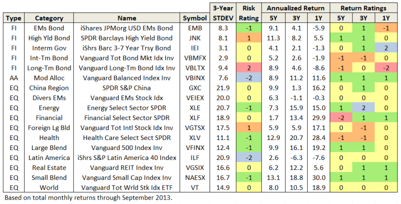
The following definitions are for metrics found in the output pages of our Risk Profile and Miraculous MultiSearch tools (examples depicted below):

definitions_headers

definitions_headers_2

Type

A fund’s broad investment approach. The MFO rating system groups funds into three types: Fixed Income (FI), Asset Allocation (AA), and Equity (EQ). Asset allocation funds typically manage a mixed portfolio of equities, bonds, cash and real property. Typically, but not always, equity funds principally invest in stocks, while fixed income funds principally invest in bonds.

Category

A fund’s current investment style as defined by Lipper. There are 155 such classifications or categories, like Large-Cap Value, Core Bond, and Alternative Long/Short Equity. A detailed description can be found here.

Annualized Percent Return (APR)

A fund’s annualized average rate of total return each year over period evaluated. It is an abstract number, or so-called “geometric return,” since actual annual returns can be well above or below the average, but annualizing greatly facilitates comparison of fund performance. APR is equivalent to CAGR, or compound annual rate of return. It reflects reinvestment of dividend and capital gain distributions, while deducting for fund expenses and fees. It excludes any sales loads.

Maximum Drawdown (MAXDD)

The percentage of greatest reduction in fund value below its previous maximum over period evaluated. MAXDD can be the most frightening of a fund’s many statistics, but surprisingly it is not widely published. Many top rated and renowned funds incurred maximum drawdowns of -60% or worse in 2009. The date (month/year) of MAXDD occurrence is also tabulated in the MFO rating system.

Standard Deviation (STDEV) 

A measure of fund volatility. The higher a fund’s standard deviation, the more its return has varied over time. That can be both good and bad, since a rise or fall in value will cause standard deviation to increase. Typically, but not always, money market funds have lowest standard deviations, stocks funds have highest, while bond funds are in-between. In the MFO rating system, STDEV indicates the typical percentage variation above or below average return a fund has experienced in a year’s time. On good or bad years, variations from average returns have been two or three times the standard deviation, and every now and then even more.

Downside Deviation (DSDEV)

Another measure of fund volatility, but it measures only downward variation. Specifically, it measures a fund’s return below the risk free rate of return, which is the 90-day T-Bill rate (aka cash). Money market and very short term bond funds typically have downside deviations very close to zero, since they normally return T-Bill rate or higher. Stock funds typically have the highest downside deviations, especially in bear markets. In the MFO rating system, DSDEV indicates the typical percentage decline below its average excess return a fund has experienced in a year’s time.

Ulcer Index (UI) 

A third measure of fund volatility and the most direct measure of a fund’s bouts with declining (and uncomfortable, hence its name) performance. It measures both magnitude and duration of drawdowns in value. A fund with high Ulcer Index means it has experienced deep or extended declines, or both. Ulcer Index for money market funds is typically zero. During bull markets, stock funds too can have a low Ulcer Index, but when the bull turns, watch out. In the MFO rating system, UI indicates the typical percentage decline in value a fund has experienced at some point during the period evaluated.

Risk Group 

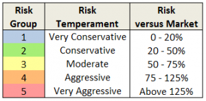
2013-06-27_1922_rev1The score or ranking used in the MFO rating system to designate a fund’s risk relative to overall market, defined by SP500 index. Funds less than 20% of market are placed in risk group 1 and deemed “very conservative,” while those greater than 125% are placed in risk group 5 deemed “very aggressive.” Note that the system uses all three risk measures (STDEV, DSDEV, and UI) and all evaluation periods across a fund’s life when making the risk determination. The evaluation periods are 1, 3, 5, 10, and 20 years, as applicable. In this way, the system can be very sensitive to risk. For example, a fund with a 10 year record of moderate risk may get an elevated risk ranking, temporarily at least, if it experiences a rough patch in the past 12 months.  Also, probably good to emphasize here that risk is fundamental to producing excess return and many top rated funds are also very aggressive. The reference market itself in the MFO system is deemed “aggressive” by definition.

Sharpe Ratio 

A measure of risk adjusted return, which is to say it helps quantify whether a fund is delivering returns commensurate with the risk it is taking. Specifically, it is the ratio of the fund’s annualized excess return divided its standard deviation. A fund’s “excess return” is any amount above risk-free investment, which is typically 90-day T-Bill. Sharpe is best used when comparing funds of same investment category over same evaluation period. The higher its Sharpe, the better a fund is performing relative to its risk, or more precisely, its volatility.

Sortino Ratio 

Another measure of risk adjusted return, but in this case it is relative to the amount of downside volatility (DSDEV) a fund incurs. It is a modification of the Sharpe intended to address a criticism that Sharpe unfairly penalizes so-called good volatility (ie., rising value), which investors don’t mind at all.  In other words, a fund that goes up much more than down may be underappreciated in Sharpe, but not Sortino. Like Shape, Sortino is best used when comparing funds of same investment category over same evaluation period.

Martin Ratio

A third measure of risk adjusted return. Like Sharpe and Sortino, it measures excess return, but relative to its typical drawdown. After the 2000 tech bubble and 2008 financial crisis, which together resulted in a “lost decade” for stocks, investors have grown very sensitive to drawdowns. Martin excels at identifying funds that have delivered superior returns while mitigating drawdowns. It too is best used when comparing funds of same investment category over same evaluation period – this very comparison is the basis for determining a fund’s Return Group rank in the MFO rating system.

Return Group 

The score or ranking of a fund’s performance based on Martin Ratio relative to other funds in same investment category over same evaluation period. The evaluation periods are 1, 3, 5, 10, and 20 years, as applicable. Funds in the top 20 percentile are placed in return group 5, while those in bottom 20 percentile are in return group 1. MFO “Great Owl” designations are assigned to funds that have earned top performance rank for all evaluation periods 3 years or longer, as applicable.

Some other qualifications:

  • The system includes oldest share class only.
  • The system does not account for category drift.
  • Funds are presented only once based on age group, but the return rankings reflect all funds existing. For example, if a 3 year fund scores a 5 return, it did so against all existing funds over the 3 year period, not just the 3 year olds.
  • All calculations are made with using monthly total returns from Lipper Data Feed Service for U.S. Open End funds.
  • The ratings are based strictly on historical returns.
  • The ratings will be updated quarterly.

Introducing MFO Fund Ratings

By Charles Boccadoro

Originally published in June 1, 2013 Commentary

One of the most frequent requests we receive is for the reconstruction of FundAlarm’s signature “most alarming funds” database.  Up until now, we haven’t done anything like it.  There are two reasons: (1) Snowball lacked both the time and the competence even to attempt it and (2) the ratings themselves lacked evidence of predictive validity.  That is, we couldn’t prove that an “Honor Roll” fund was any likelier to do well in the future than one not on the honor roll.

We have now budged on the matter.  In the spirit of those beloved fund ratings, MFO will maintain a new system to highlight funds that have delivered superior absolute returns while minimizing down side volatility.  We’re making the change for two reasons. (1) Associate editor Charles Boccadoro, a recently-retired aerospace engineer, does have the time and competence.  And, beyond that, a delight in making sense of data. And (2) there is some evidence that risk persists even if returns don’t. That is, managers who’ve taken silly, out-sized, improvident risks in the past will tend to do so in the future.  We think of it as a variant of the old adage, “beauty is just skin-deep, but ugly goes all the way to the bone.”

There are two ways of explaining what we’re up to.  We think of them as “the mom and pop explanation” and the “Dr. Mom and Ph.D. Pop explanation.”  We’ll start with the M&P version, which should be enough for most of us.

Dear Mom and Pop,

Many risk measures look at the volatility or bounciness of a portfolio, both on the upside and the downside.  As it turns out, investors don’t mind having funds that outperform their peers in rising markets; that is, they don’t immediately reject upside volatility.  What they (we!) dread are excessive drawdowns: that is, having their returns go down far and hard.  What Charles has done is to analyze the performance of more than 7000 funds for periods ranging back 20 years.  He’s calculated seven different measures of risk for each of those funds and has assigned every fund into one of five risk groups from “very conservative” funds which typically absorb no more than 20% of a stock market decline to “very aggressive” ones which absorb more than 125% of the fall.  We’ve assembled those in a large spreadsheet which is on its way to becoming a large, easily searchable database.

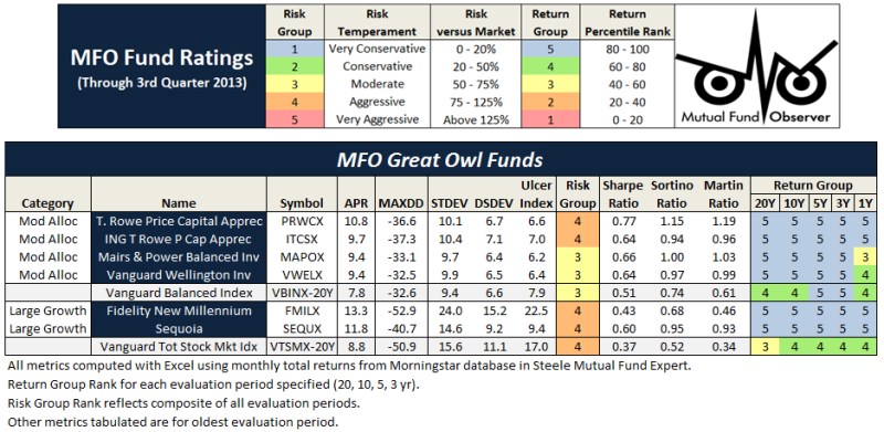
For now, we’ve got a preview.  It focuses on the funds with the most consistently excellent 20-year returns (the happy blue boxes on the right hand side, under “return group”), lets you see how much risk you had to absorb to achieve those returns (the blue to angry red boxes under risk group) and the various statistical measures of riskiness.  In general, you’d like to see low numbers in the columns to the left of the risk group and high numbers in the columns to the right.

I miss the dog.  My roommate is crazy.  The pizza has been good.  I think the rash is mostly gone but it’s hard to see back there.  I’m broke.  Say “hi” to gramma.  Send money soon.

Love, your son,

Dave

And now back to the data and the serious explanation from Charles:

The key rating metric in our system is Martin ratio, which measures excess return divided by the drawdown (a/k/a Ulcer) index. Excess return is how much a fund delivers above the 90-day Treasury bill rate. Ulcer index measures depth and duration of drawdowns from recent peaks – a very direct gauge of unpleasant performance. (More detailed descriptions can be found at Ulcer Index and A Look at Risk Adjusted Returns.)

The rating system hierarchy is first by evaluation period, then investment category, and then by relative return. The evaluation periods are 20, 10, 5, 3, and 1 years. The categories are by Morningstar investment style (e.g., large blend). Within each category, funds are ranked based on Martin ratio. Those in the top 20 percentile are placed in return group 5, while those in bottom 20 percentile are in return group 1. Fund ratings are tabulated along with attendant performance and risk metrics, by age group, then category, then return group, and finally by absolute return.

MFO “Great Owl” designations are assigned to consistent top performers within the 20 and 10 year groups, and “Aspiring Great Owl” designations are similarly assigned within the 5 and 3 year groups.

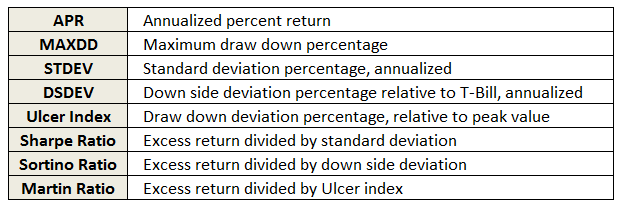
The following fund performance and risk metrics are tabulated over each evaluation period:

legend

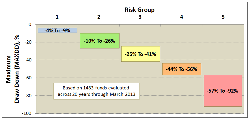
A risk group is also tabulated for each fund, based simply on its risk metrics relative to SP500. Funds less than 20% of market are placed in risk group 1, while those greater than 125% are placed in risk group 5. This table shows sample maximum drawdowns by risk group, depicting average to worst case levels. 

risk v drawdown

Some qualifications:

  • The system includes oldest share class only and excludes the following categories: money market, bear market, trading inverse and leveraged, volatility, and specialized commodities.
  • The system does not account for category drift.
  • Returns reflect maximum front load, if applicable.
  • Funds are presented only once based on age group, but the return rankings reflect all funds existing. For example, if a 3 year fund scores a 5 return, it did so against all existing funds over the 3 year period, not just the 3 year olds.
  • All calculations are made with Microsoft’s Excel using monthly total returns from the Morningstar database provided in Steele Mutual Fund Expert.
  • The ratings are based strictly on historical returns.
  • The ratings will be updated quarterly.

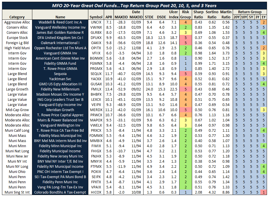
We will roll-out the new system over the next month or two. Here’s a short preview showing the MFO 20-year Great Owl funds – there are only 48, or just about 3% of all funds 20 years and older. 

2013-05-29_1925_rev1 chart p1chart p2

31 May 2013/Charles

(p.s., the term “Great Owl” funds is negotiable.  We’re looking for something snazzy and – for the bad funds – snarky.  “Owl Chow funds”?  If you’re a words person and have suggestions, we’d love to hear them.  Heck, we’d love to have an excuse to trick Barb into designing an MFO t-shirt and sending it to you.  David)

Three Messages from Rob Arnott

By Charles Boccadoro

Originally published in May 1, 2013 Commentary

Robert D. Arnott manages PIMCO’s All Asset (PAAIX) and leveraged All Asset All Authority (PAUIX) funds. Morningstar gives each fund five stars for performance relative to moderate and world allocation peers, in addition to gold and silver analyst ratings, respectively, for process, performance, people, parent and price. On PAAIX’s performance during the 2008 financial crises, Mr. Arnott explains: “I was horrified when we ended the year down 15%.” Then, he learned his funds were among the very top performers for the calendar year, where average allocation funds lost nearly twice that amount. PAUIX, which uses modest leverage and short strategies making it a bit more market neutral, lost only 6%.

Of 30 or so lead portfolio managers responsible for 110 open-end funds and ETFs at PIMCO, only William H. Gross has a longer current tenure than Mr. Arnott. The All Asset Fund was launched in 2002, the same year Mr. Arnott founded Research Affiliates, LLC (RA), a firm that specializes in innovative indexing and asset allocation strategies. Today, RA estimates $142B is managed worldwide using its strategies, and RA is the only sub-advisor that PIMCO, which manages over $2T, credits on its website.

On April 15th, CFA Society of Los Angeles hosted Mr. Arnott at the Montecito Country Club for a lunch-time talk, entitled “Real Return Investing.” About 40 people attended comprising advisors, academics, and PIMCO staff. The setting was elegant but casual, inside a California mission-style building with dark wooden floors, white stucco walls, and panoramic views of Santa Barbara’s coast. The speaker wore one of his signature purple-print ties. After his very frank and open talk, which he prefaced by stating that the research he would be presenting is “just facts…so don’t shoot the messenger,” he graciously answered every question asked.

Three takeaways: 1) fundamental indexing beats cap-weighed indexing, 2) investors should include vehicles other than core equities and bonds to help achieve attractive returns, and 3) US economy is headed for a 3-D hurricane of deficit, debt, and demographics. Here’s a closer look at each message:

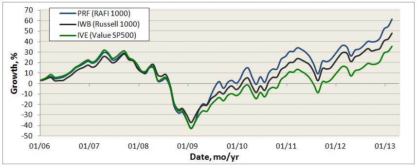
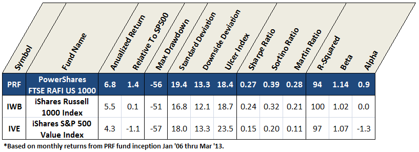
Fundamental Indexation is the title of Mr. Arnott’s 2005 paper with Jason Hsu and Philip Moore. It argues that capital allocated to stocks based on weights of price-insensitive fundamentals, such as book value, dividends, cash flow, and sales, outperforms cap-weighted SP500 by an average of 2% a year with similar volatilities. The following chart compares Power Shares FTSE RAFI US 1000 ETF (symbol: PRF), which is based on RA Fundamental Index (RAFI) of the Russell 1000 companies, with ETFs IWB and IVE:

May 1, 2013

And here are the attendant risk-adjusted numbers, all over same time period:

May 1, 2013

RAFI wins, delivering higher absolute and risk-adjusted returns. Are the higher returns a consequence of holding higher risk? That debate continues. “We remain agnostic as to the true driver of the Fundamental indexes’ excess return over the cap-weighted indexes; we simply recognize that they outperformed significantly and with some consistency across diverse market and economic environments.” A series of RAFIs exist today for many markets and they consistently beat their cap-weighed analogs.

All Assets include commodity futures, emerging market local currency bonds, bank loans, TIPS, high yield bonds, and REITs, which typically enjoy minimal representation in conventional portfolios. “A cult of equities,” Mr. Arnott challenges, “no matter what the price?” He then presents research showing that while the last decade may have been lost on core equities and bonds, an equally weighted, more broadly diversified, 16-asset class portfolio yielded 7.3% annualized for the 12 years ending December 2012 versus 3.8% per year for the traditional 60/40 strategy. The non-traditional classes, which RA coins “the third pillar,” help investors “diversify away some of the mainstream stock and bond concentration risk, introduce a source of real returns in event of prospective inflation from monetizing debt, and seek higher yields and/or rates of growth in other markets.”

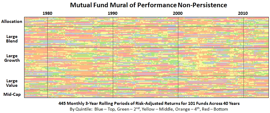
Mr. Arnott believes that “chasing past returns is likely the biggest mistake investors make.” He illustrates with periodic returns such as those depicted below, where best performing asset classes (blue) often flip in the next period, becoming worst performers (red)…and rarely if ever repeat.

May 1, 2013

Better instead to be allocated across all assets, but tactically adjust weightings based on a contrarian value-oriented process, assessing current valuation against opportunity for future growth…seeking assets out of favor, priced for better returns. PAAIX and PAUIX (each a fund of funds utilizing the PIMCO family) employ this approach. Here are their performance numbers, along with comparison against some competitors, all over same period:

May 1, 2013

The All Asset funds have performed very well against many notable allocation funds, like OAKBX and VWENX, protecting against drawdowns while delivering healthy returns, as evidenced by high Martin ratios. But static asset allocator PRPFX has actually delivered higher absolute and risk-adjusted returns. This outperformance is likely attributed its gold holding, which has detracted very recently. On gold, Mr. Arnott states: “When you need gold, you need gold…not GLD.” Newer competitors also employing all-asset strategies are ABRYX and AQRIX. Both have returned handsomely, but neither has yet weathered a 2008-like drawdown environment.

The 3-D Hurricane Force Headwind is caused by waves of deficit spending, which artificially props-up GDP, higher than published debt, and aging demographics. RA has published data showing debt-to-GDP is closer to 500% or even higher rather than 100% value oft-cited, after including state and local debt, Government Sponsored Enterprises (e.g., Fannie Mae, Freddie Mac), and unfunded entitlements. It warns that deficit spending may feel good now, but payback time will be difficult.

“Last year, the retired population grew faster than the population of working age adults, yet there was no mention in the press.” Mr. Arnott predicts this transition will manifest in a smaller labor force and lower productivity. It’s inevitable that Americans will need to “save more, spend less, and retire later.” By 2020, the baby boomers will be outnumbered 2:1 by votes, implying any “solemn vows” regarding future entitlements will be at risk. Many developed countries have similar challenges.

Expectations going forward? Instead of 7.6% return for the 60/40 portfolio, expect 4.5%, as evidenced by low bond and dividend yields. To do better, Mr. Arnott advises investing away from the 3-D hurricane toward emerging economies that have stable political systems, younger populations, and lower debt…where fastest GDP growth occurs. Plus, add in RAFI and all asset exposure.

Inoculated By Value

By Charles Boccadoro

Originally published in April 1, 2013 Commentary

To describe Richard P. Cook and J. Dowe Bynum (C&B) as value investors would be accurate, but certainly not adequate. Their website is rich with references to value investment principles championed by Benjamin Graham, John Burr Williams, Charlie Munger, and Warren Buffet. “The value investing inoculation took immediately,” C&B explain, after reading Mr. Buffett’s biography in high school. They have been investing together literally since childhood and at age 23 they actually tried to start their own mutual fund. That did not happen, but years later in 2001 they established Cook & Bynum Capital Management and in mid-2009 they launched their namesake The Cook & Bynum Fund COBYX, which turned out to be perfect timing.

Like many experienced investors on MFO, C&B do not view volatility as risk, but as opportunity. That said, the lack of volatility in 43 months of COBYX performance through February 2013 is very alluring and likely helped propel the fund’s popularity, now with $102M AUM. Its consistent growth rate resembles more a steady bond fund, say PONDX, than an equity fund. The fund received a 5-Star Morningstar Rating for the 3-year period ending mid-2012.

Other than strictly adhering to the three most important words of value investing (“Margin of Safety”) when assessing stock price against inherent value, C&B do not impose explicit drawdown control or practice dynamic allocation, like risk-parity AQRNX or long-short ARLSX. They try instead to buy wonderful businesses at discounted prices. To quote Mr. Buffett: “If you’re right about what, you don’t have to worry about when very much.”

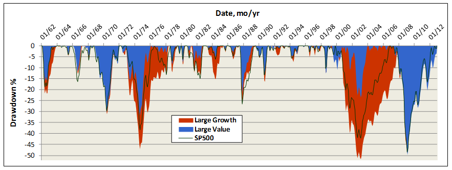
Fortunately, history is on their side. The chart below depicts drawdowns for the last 50 years, comparing value versus growth large cap fund averages. Value funds indeed generally suffer smaller and shorter drawdowns. But not always. The term “value trap” became ubiquitous during the financial collapse of 2008, when many highly respected, long established, and top performing value funds (prime example DODGX) were simply hammered. And, when the forest is burning, all the trees go with it.

April 1, 2013

While Mr. Cook and Mr. Bynum must have managed their private accounts through such turbulent times, COBYX has enjoyed bull market conditions since its inception. (Perhaps a reluctant bull, but nonetheless…) Still, when the market dipped 7% in May 2012, COBYX did not drop at all. In September 2011, SP500 dropped 16%, COBYX dipped only 5%. Its biggest drawdown was June 2010 at 9% versus 13% for the market. The tame behavior is due partly to C&B’s propensity to hold cash. Not as a strategy, they explain, but as residual to value opportunities available. They unloaded Kraft, for example, shortly after the company split its international and domestic businesses. Here is an excerpt from COBYX’s 2012 annual report explaining their move:

Despite neither of the companies’ fundamental business prospects changing one iota, the market reacted to the news by trading both of the stocks higher. We used this opportunity to liquidate our stake in both companies. It is popular, even within our value discipline, for investors to advocate various financial engineering strategies in an attempt to drive near-term stock price appreciation rather than to focus on a company’s long-term cash flows – where real value resides.

C&B take pride in not being “closet indexers” to their benchmarks SP500 and MSCI All Country World Index (ACWI). So far they have tended to hold consumer defensive stocks, like Wal-Mart, Procter & Gamble, and Coca-Cola. Although more recently, they own Microsoft, which accounts for 16% of the portfolio. COBYX’s lifetime correlation to SP500 is 66% and its beta is only 0.47.

The strategy has delivered handsomely. Just how good is it? Below compares COBYX with several other Morningstar 5 star funds, including Charles Akre’s AKREX, Steven Romick’s FPA Crescent Fund, Donald Yacktman’s YAFFX, Sequoia Fund (perhaps the greatest fund ever), plus landmark Berkshire Hathaway.

April 1, 2013

Since COBYX inception, it has produced the highest risk adjusted returns, based on both Sharpe and Sortino Ratios, with the lowest standard and downside volatilities. It has delivered more than 90% of SP500 total return with less than 60% of its volatility. Interestingly, all of these top-performing mutual funds have low beta against SP500, like COBYX, but again for the record, C&B reject metrics like beta: “Risk is not volatility.”

COBYX is also highly concentrated. As of December 2012, it held only seven equities. C&B’s strategy is to focus only on companies whose businesses they can understand – depth of insight is the edge they seek. They employ Kelly Criterion to size positions in their portfolio, which represents an implicit form of risk management. John Kelly developed it in 1950s at AT&T’s Bell Labs to optimize transmission rate through long distance phone lines. Edward Thorpe then famously employed the technique to “Beat the Dealer” and later to help optimize his hedge fund investments at Princeton/Newport Partners. In C&B’s implementation, Kelly is edge over odds, or expected returns over range of outcomes. What is currently their biggest position? Cash at 34%.

Bottom-line: Hard not to love this young fund, performance to date, and philosophy employed by its managers. High ER, recently dropped from 1.88 to 1.49, has been its one detractor. Hopefully, ER reduction continues with AUM growth, since world-stock fund median is already a hefty 1.20 drag.

(Thank you, sir! David)

10 mo SMA Method In Down Markets

By Charles Boccadoro

From the Mutual Fund Observer discussion board, March 2013

In the post 10 mo SMA Method Applied To D&C Funds, Andrei and Investor generally felt the results were overly influenced by the 2008 crisis and wondered how Flack’s simple timing method would perform during other drawdowns. I shared their curiosity and looked back at the past 7 down markets, defined as SP500 being down 15% or more. For this analysis, instead of using exchange traded funds, like IEF and SPY, or a specific traditional fund pair, like DODIX and DODGX, I used SP500 TR and the Barclays Intermediate Treasury TR Index, which dates back to Jan 1973.

Before presenting lifetime results, which once again are strongly in favor of the timing method, I want to focus on the 7 drawdowns:

image

The 10 mo SMA approach mitigated all losses, except for the short-term drawdowns, like Andrei suspected, in ’98 and ’90, which lasted only 5 and 9 months, respectively. There was simply no protection during these sudden drawdowns, other than not being in the market…or, having wisdom and ability to just ride them out.

In fact, in the four down markets where the descent or ascent was less than half the 10 month averaging period (I suppose a kind of folding frequency criteria), the 60/40 equity/bond fixed method provided the most protection.

The 10 mo SMA method protected best when the periods were longest, like ’74, ’02, and ’08. It also shortened the worst drawdown durations substantially. For the past 40 years, the longest drawdown for SP500 was 72 months, for 60/40 fixed was 50 months, but only 27 months for 10 mo SMA timing method.

Here is lifetime performance comparison:

image

Comparison over 435 3-year rolling and 415 5-year rolling periods:

image

Here are the timing and lifetime growth charts:

image

Finally, here’s growth comparison on log scale to get better appreciation of behavior in earlier years. In addition to larger lifetime growth, the curve shows the timing method provides straightest curve…translation, most consistent return:

image

The analysis does point out the Achilles’ heel of the method, which we saw some of in the first post Flack’s SMA Method when examining selling short instead of switching to bonds. Basically, if the market movements are too sudden compared to the averaging window, the method cannot be responsive enough. It can experience a quick fall and miss a quick rise. If these quick movements persist, the method can get out-of-sync (phase) with the market, which can result in under performance compared to fixed portfolios.

But since 1973, it has delivered FCNTX-like 12.1% annualized returns with DODBX-like volatility.

I remain very impressed and have decided to start employing Flack’s suggestion on a portion of my portfolio, basically, for a D&C account holding. On a monthly basis, when DODGX is above its 10 SMA, I will have 75% in DODGX and 25% in DODIX. When it is below, I will reverse and have 75% in DODIX and 25% in DODGX. Not quite the all-in/all-out approach like the cases analyzed, but right for me at this time. Will compile results starting next Monday as best I can and post periodically how it’s doing.

Here is link to original thread.

Few Alternatives to MAINX

By Charles Boccadoro

Originally published in February 1, 2013 Commentary

Matthews Asia Strategic Income Fund (MAINX) is a unique offering for US investors. While Morningstar identifies many emerging market and world bond funds in the fixed income category, only a handful truly focus on Asia. From its prospectus:

Under normal market conditions, the Strategic Income Fund seeks to achieve its investment objective by investing at least 80% of its total net assets…in the Asia region. ASIA: Consists of all countries and markets in Asia, including developed, emerging, and frontier countries and markets in the Asian region.

Fund manager Teresa Kong references two benchmarks: HSBC Asian Local Bond Index (ALBI) and J.P. Morgan Asia Credit Index (JACI), which cover ten Asian countries, including South Korea, Hong Kong, India, Singapore, Taiwan, Malaysia, Thailand, Philippines, Indonesia and China. Together with Japan, these eleven countries typically constitute the Asia region. Recent portfolio holdings include Sri Lanki and Australia, but the latter is actually defined as Asia Pacific and falls into the 20% portfolio allocation allowed to be outside Asia proper.

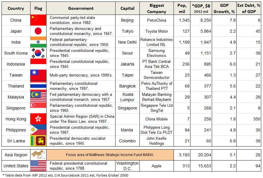
As shown in following table, the twelve Asian countries represented in the MAINX portfolio are mostly republics established since WWII and they have produced some of the world’s great companies, like Samsung and Toyota. Combined, they have ten times the population of the United States, greater overall GDP, 5.1% GDP annual growth (6.3% ex-Japan) or more than twice US growth, and less than one-third the external debt. (Hong Kong is an exception here, but presumably much of its external debt is attributable to its role as the region’s global financial center.)

February 1, 2013

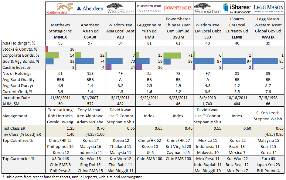
Very few fixed income fund portfolios match Matthews MAINX (or MINCX, its institutional equivalent), as summarized below. None of these alternatives hold stocks.

February 1, 2013

 Aberdeen Asian Bond Fund CSBAX and WisdomTree ETF Asian Local Debt ALD cover the most similar geographic region with debt held in local currency, but both hold more government than corporate debt. CSBAX recently dropped “Institutional” from its name and stood-up investor class offerings early last year. ALD maintains a two-tier allocation across a dozen Asian countries, ex Japan, monitoring exposure and rebalancing periodically. Both CSBAX and ALD have about $500M in assets. ALD trades at fairly healthy volumes with tight bid/ask spreads. WisdomTree offers a similar ETF in Emerging Market Local Debt ELD, which comprises additional countries, like Russia and Mexico. It has been quite successful garnering $1.7B in assets since inception in 2010. Powershares Chinese Yuan Dim Sum Bond ETF DSUM (cute) and similar Guggenheim Yuan Bond ETF RMB (short for Renminbi, the legal tender in mainland China, ex Hong Kong) give US investors access to the Yuan-denominated bond market. The fledgling RMB, however, trades at terribly low volumes, often yielding 1-2% premiums/discounts.

A look at life-time fund performance, ranked by highest APR relative to 3-month TBill:

February 1, 2013

Matthews Strategic Income tops the list, though of course it is a young fund. Still, it maintains low down side volatility DSDEV and draw down (measured by Ulcer Index UI). Most of the offerings here are young. Legg Mason Western Asset Global Government Bond (WAFIX) is the oldest; however, last year it too changed its name, from Western Asset Non-U.S. Opportunity Bond Fund, with a change in investment strategy and benchmark.

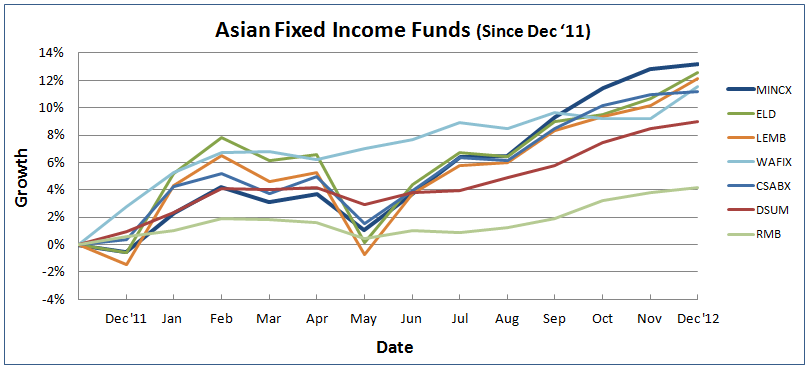
Here’s look at relative time frame, since MAINX inception, for all funds listed:

February 1, 2013

February 1, 2013

Charles, 25 January 2013

Four Funds for a Lifetime

By Charles Boccadoro

From the Mutual Fund Observer discussion board, January 2013

After last discussion, A Look at Risk Adjusted Returns, I wanted to explore further the issues of under performance and substantial down years for even top ranked risk adjusted funds. Building on a tip from MikeM:

I used to do my own risk analysis by just calculating the probability of what a fund could make or loose in any given year. Probability is just a calculation using the funds average returns and its standard deviation. Using 1x stdev would give you a probability confidence value of 68%. 2x stdev would be 95%.

Instead of standard deviation STDEV, however, I focused on the down side and draw down deviations that represent the denominators in Sortino and Martin ratios, respectively. The Sortino denominator is the annualized downside deviation DSDEV, which uses only monthly returns falling below TBill average. The Martin denominator is the Ulcer Index (UI), which is the square root of the mean of the squared percentage draw downs in value.

I imposed a threshold on these two measures to protect against substantial down year performance. The threshold assumed a simple, four fund portfolio – one fund in each broad type (equity, asset allocation or “balanced,” fixed income, and money market), each holding equal share.

For pain threshold, I used 15% loss for the portfolio in a down year. Nominally, this translates to a maximum tolerable loss of 30% in the equity fund, 20% in asset allocation fund, 10% in the fixed, and zero for money market.

Accounting for a 3x deviation down side occurrence (more conservative than MikeM’s example), the attendant thresholds become 10% for equity funds, 7% for asset allocation, and 4% for fixed income, in round numbers.

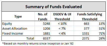
First off, it is extraordinary just how many equity funds fail to meet this 10% down side threshold on either DSDEV or UI! Here is a summary of funds evaluated, all oldest share class:

FF_Figure 1

Once the funds were screened for down side volatility, I simply sought top returning funds for each type, relative to SP500 for equity and asset allocation, and TBill for fixed income and money market. This step protects against selecting an under performing fund that may have a very high risk-adjusted rate of return. Below is the result, by fund inception date:

FF_Figure 2FF_Figure 3FF_Figure 4FF_Figure 5FF_Figure 6FF_Figure 7FF_Figure 8FF_Figure 9FF_Figure 10FF_Figure 11FF_Figure 12Some observations:

  • Worst performing year (highlighted in red) was 2008, of course, with the 15+ age group portfolio down the most at -13.7%, but still within the -15% pain threshold.
  • Overall portfolio lifetime returns (green) appear very respectable for all age groups, most even beating SP500 (blue), despite the healthy cash holding.
  • Great returns are achievable without high volatility, evidenced by some seriously good funds included on this list, like Sequoia SEQUX, Vanguard Wellesley Inc Investor VWINX, Mutual Quest Z MQIFX, Oakmark Equity & Income I OAKBX, Osterweis Strategic Income OSTIX, and Yacktman Svc YACKX.
  • The 25+ age portfolio produced 9.7% APR versus 8.9% for SP500. It includes stand outs Vanguard Health Care Investor VGHCX, T. Rowe Price Cap Appreciation PRWCX, and PIMCO Total Return Institutional PTTRX.
  • The 5+ age portfolio produced 7% APR versus 1.7% for the SP500. It includes MainStay Marketfield I MFLDX and PIMCO Income A PONAX. – In the 40+ age group, only one money market fund existed, so that was included by default, even though it has a negative lifetime Sharpe.

Of the fifteen fixed income funds in the 50+ age group, none met the less the 4% down side volatility criteria. I’m pretty impressed with the result actually. The simple approach imposed a 10-7-4 down side volatility screen, then sought top returning APR, un-adjusted. Now, if I could only figure out how to ensure it works going forward…

Here is link to original thread.

A Look at Risk Adjusted Returns

By Charles Boccadoro

From the Mutual Fund Observer discussion board, January 2013

A recent thread by hank, catch22, bee, MikeM, and Investor got me thinking about risk adjusted returns. Here is a link to their discussion: How To Calculate Risk-Adjusted Rate of Return.

With same database of oldest share class fund performance from Funds That Beat The Market, I ranked funds by Sharpe, Sortino, and Martin (or so-called Ulcer Performance) indices then compared against relative APR rankings.

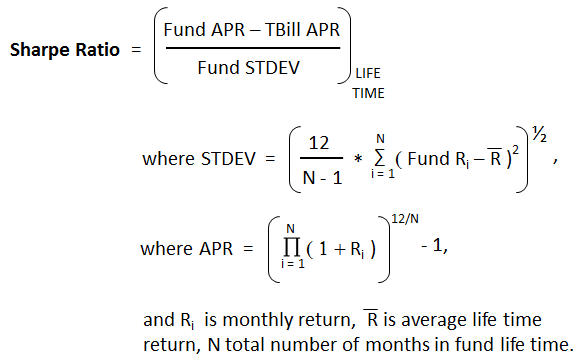
For this comparison, Sharpe is defined as fund annualized percentage return (APR) minus 90-day TBill APR divided by fund annualized standard deviation STDEV, all over the same period, which is lifetime of fund (or back to January 1962). Here is the formula used:

sharpe

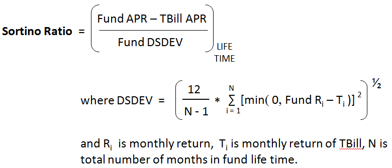
Sortino is same as Sharpe except its denominator is the annualized downside deviation, which only uses monthly returns falling below TBill average, as shown here:

2013-05-31_1506

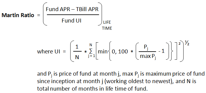
Finally, Martin, which uses same numerator as Sharpe and Sortino, excess return relative to TBill, but it uses the Ulcer Index (UI) for the denominator, which is the square root of the mean of the squared percentage draw downs in value. Here is link to good article: Ulcer Index – An Alternative Approach to the Measurement of Investment Risk & Risk-Adjusted Performance. Here is how I applied its formula:

2013-01-14_1428

OK, a few comparisons that I found insightful:

50eq
Mutual Shares Z MUTHX is the top performer in APR relative to SP500 and tops all risk adjusted return (RAR) indices in the 50 year equity category. Still, in 2008, it drew down 38%, just like the SP500. American Funds American A AMRMX, on the other hand, one of top three funds picked up by Martin Ratio had a more tempered loss. All top RAP funds in this category in fact had hefty losses in 2008, except AMRMX.

40eq
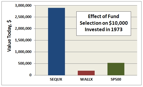
Here’s an example where I think RAR indices really tell the story. Fidelity Magellan FMAGX has best life time APR, but it loses to Sequoia SEQUX in every RAR category. SEQUX produced only a moderate draw down in 2008. Of course, SEQUX may be the best mutual fund of all time…and it shows in the RAR indices.

40aa
The stark comparison between First Eagle Global A SGENX and Vanguard Wellesley Income Inv VWINX is another good example of the power of RAR indices. In fact, every top performer in this modest asset allocation class suffered losses of more than 20% in 2008, except VWINX, which has highest Sharpe, Sortino, and Martin ratios, as well as lowest downside deviation and Ulcer Index.

30eq
Ditto here for the 30 year equity category. While Fidelity Select Health Care FSPHX produced the highest returns relative to SP500, Mutual Quest Z MQIFX would be my fund of choice, topping all RAR indices. It is the only top fund that lost less than 30% in 2008 – notice its DSDEV and UI values are also lowest.

25aa
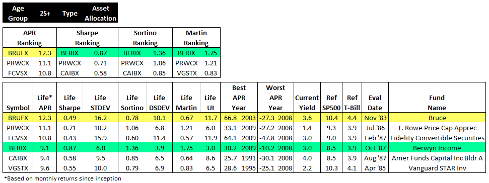
Berwyn Income BERIX is top risk adjusted performer over Bruce BRUFX…and T. Rowe Price Capital Appreciation PRWCX, Morningstar’s top allocation fund this year, does well also.

15eq
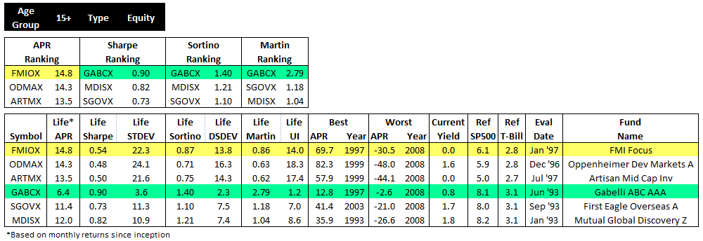
Finally, here is an example that shows how RARs can be too protective. Gabelli ABC AAA GABCX certainly takes top honors for risk adjusted returns in the 15 year equity category, but it also produced low absolute returns.

Some takeaways:

  • Risk adjusted performance indices can indeed provide stark distinctions in fund selection, especially for those sensitive to downside risk.
  • Sortino and Martin indices are most reflective of downside risk, but Sharpe nonetheless is better than just looking at APR.
  • A limitation to RAR indices is that they are useful only in relative sense, since their absolute values change with market. Their utility is in comparing funds over same time period.
  • Top performing RAR funds may under perform in absolute returns, and worse, they can still have substantial down years.

Here is link to original thread.

Mutual Funds That Beat The Market

By Charles Boccadoro

From the Mutual Fund Observer discussion board, December 2012, compiled from original five parts

Wise advice by MJG in the recent post “Will you revise your fund holdings going into 2013, regardless of “fiscal cliff”, etc.?” got me thinking…

He said, “The accumulated data finds that only a small percentage of wizards beat their proper benchmarks annually, and that percentage drops precipitously as the time horizon is expanded. Superior performance persistence is almost nonexistent.”

So I dug into it a bit. Here are the results, divided into five sections: Summary, Equity, Asset Allocation, Fixed Income, and Money Market.

Summary

The table below summarizes how many funds have beaten the market since their inception (or since Jan 1962, as far back as my Steele Mutual Fund Expert database goes). I used only whole months in the calculations so that I could be consistent with two market benchmarks, the SP500 total return (since 1970, price only before) and the 30-day Treasury Bill.

1_2013-01-03_1424

Nearly 9000 mutual funds and ETFs were evaluated. I used load adjusted returns and only the oldest share class. I apologize to the bench mark police for using only SP500 and T-Bill. Nonetheless, I find the results interesting.

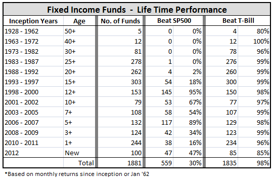
First, MJG is right. Less than half of all equity funds have beaten the SP500 over their life times; in fact, one in four have not even beaten the T-Bill, which means their Sharpe Ratios are less than zero!

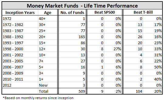
Second, nearly all fixed income funds have beaten T-Bill performance, which is re-assuring, but fuels the perception that you can’t lose money with bonds. The money market comparison is a bit skewed, because many of these funds are tax exempt. Still, expense ratios must be having their negative effect as only one in five such funds beat the T-Bill.

Digging a bit further, I looked at how the funds did by inception date. Here is a result I can’t yet explain and would ask for the good help on MFO to better understand. It seems like the period from 1998 to 2002, which book-end the tech bubble, is a golden age, if you will, for funds, as more than 60% of the funds initiated during this period have beaten the SP500 over their life times. That’s extraordinary, no? I thought maybe that it was because they were heavily international, small cap, or other, but I have not yet found the common thread for the superior performance.
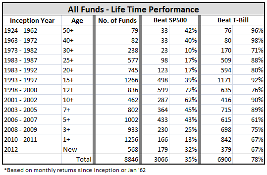
2_2013-01-03_1425

On the other hand, the period from 1973 to 1982 was abysmal for funds, since only one in ten equity funds created during these years have beaten the SP500 over their life times. And it is not much better between 1983 and 1992.

I next broke-out this same performance by type: equity, asset allocation, fixed income, and money market:
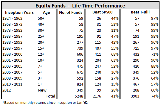
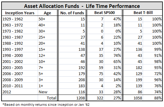
3_2013-01-03_1427

4_2013-01-03_1428

5_2013-01-03_1429

6_2013-01-03_1429

Note that fixed income funds helped contribute to the “golden period” as more than a quarter of those incepted between 1998 and 2000 beat the SP500.

Some other interesting points:

  • Relatively few money market funds have been created since the cash bull run of the ’80s.
  • But otherwise, fund creation is alive and well, with nearly 2000 funds established in the past three years, which accounts for one fifth of all funds in existence.
  • Fixed income fund performance has dropped a bit this year with 15 out of 100 losing money.

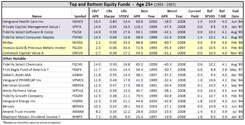
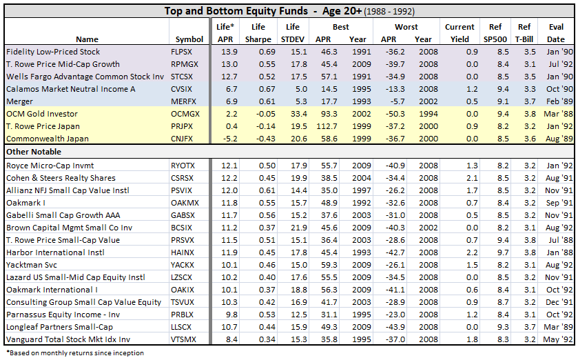
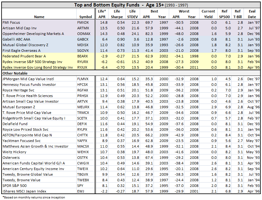
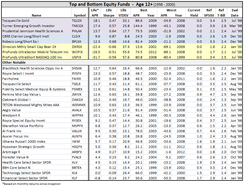
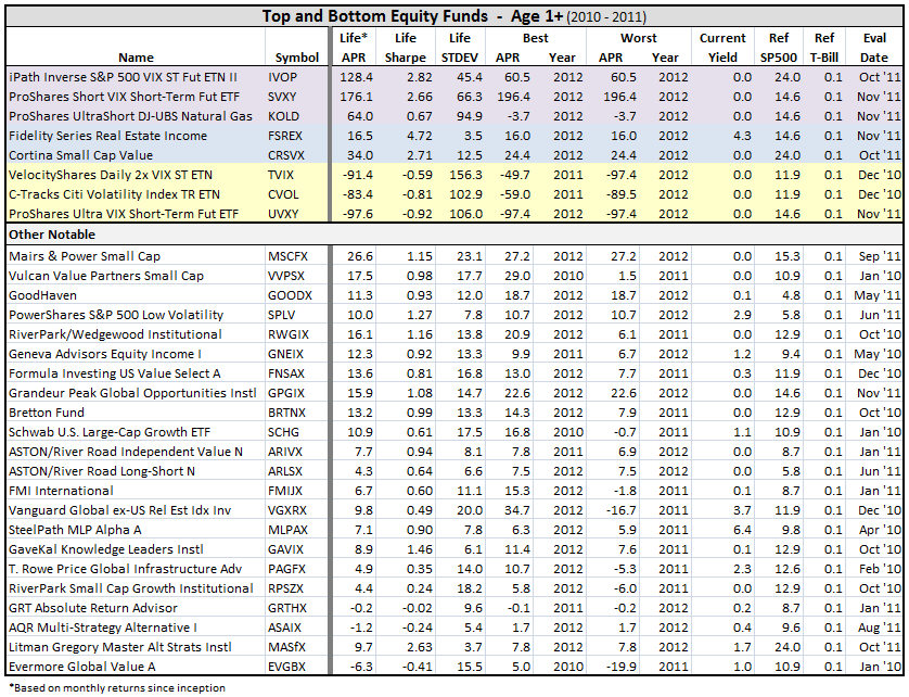
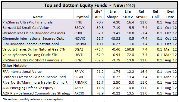
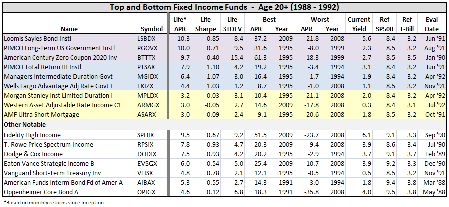
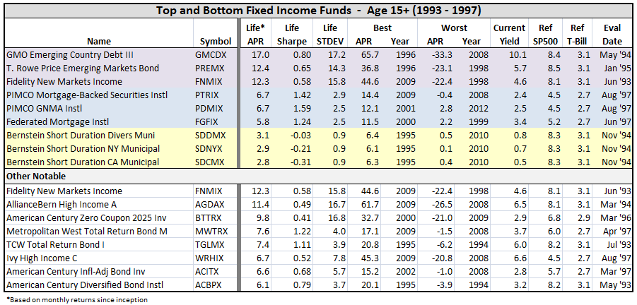
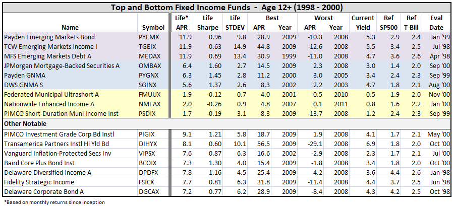
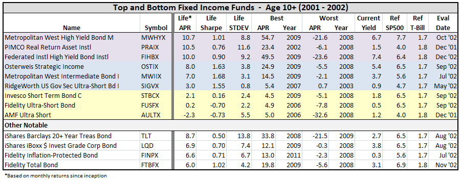
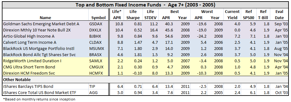
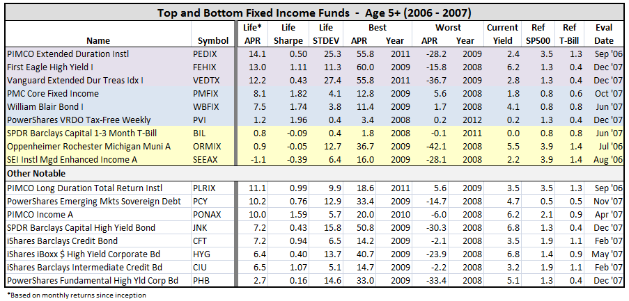
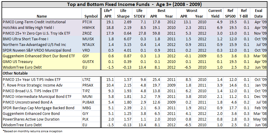
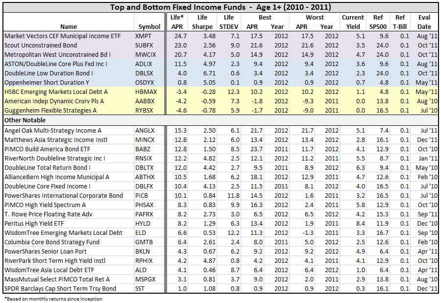
I next looked at the best and worst performers in their respective time frames.

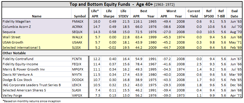
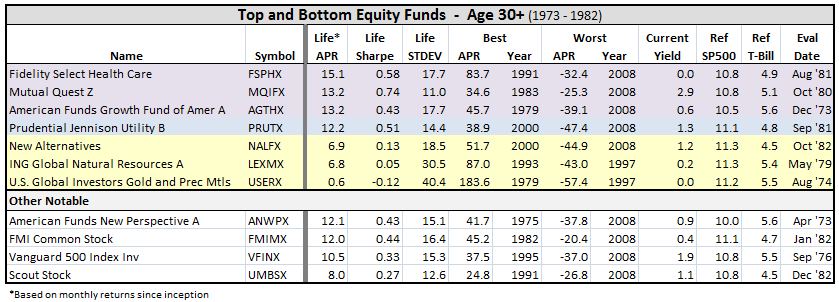
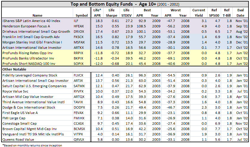
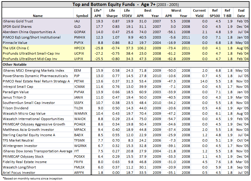
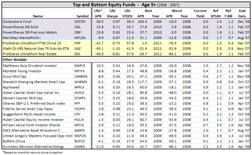
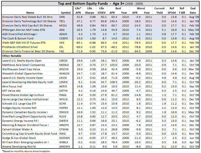
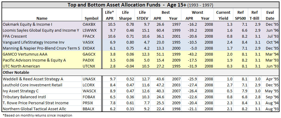
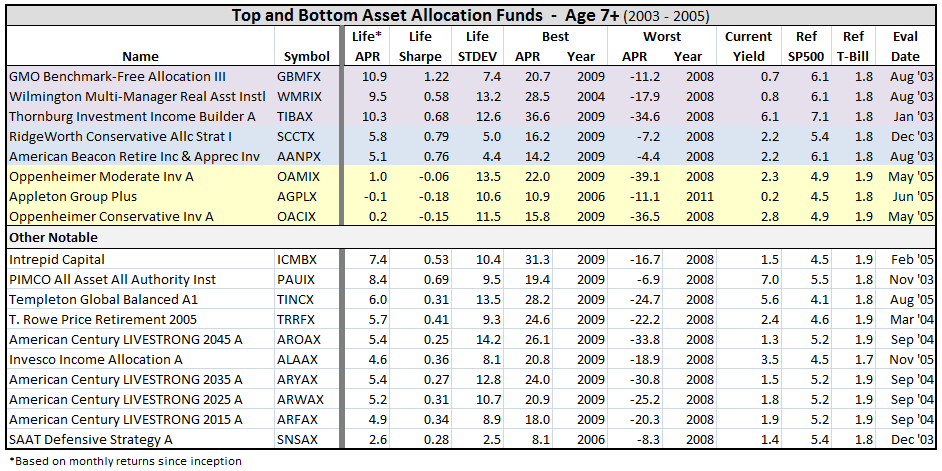
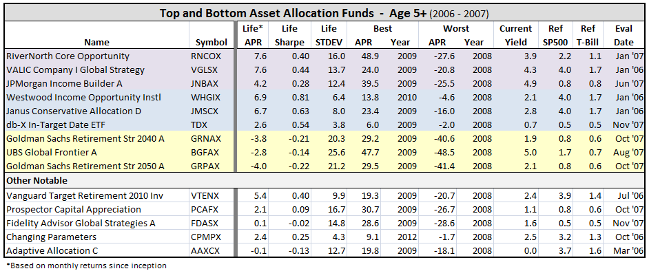
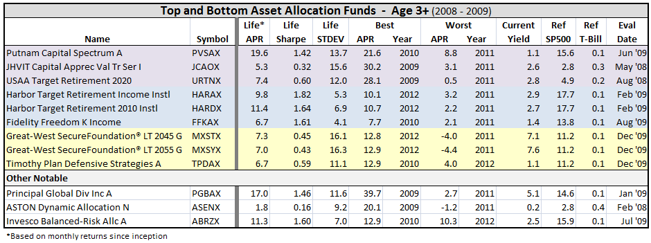
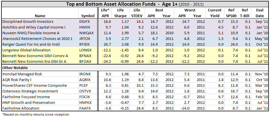
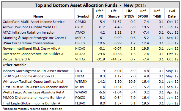
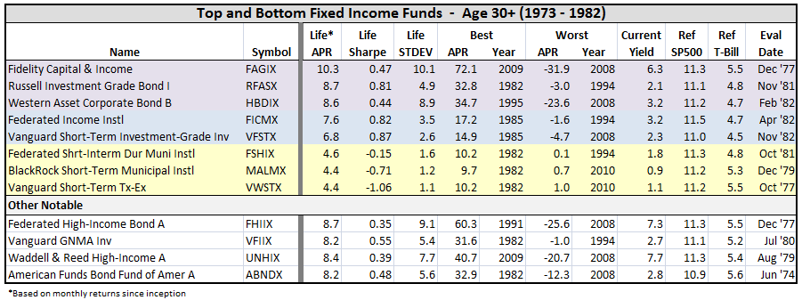
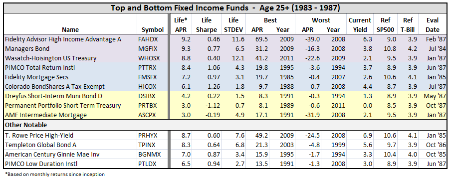
Best being top three funds, typically, producing highest APR relative to SP500 for equity and asset allocation types and relative to T-Bill for fixed income and money market types, color coded purple. Best also includes funds with highest Sharpe Ratios, color coded blue, when different from top APR funds. Again, I tried to pick three if there were enough funds for the inception period evaluated. Worst being relative APR, color coded yellow.

I included other notables based on David’s fund profiles (there are nearly 70 in the index), suggestions by other MFO folks, a few runner-ups, and some funds of my own interest.

First up, equity funds…

Equity Funds

1_2012-12-29_2117 2_2012-12-29_2118 3_2012-12-29_2119 4_2012-12-29_2120 5_2012-12-29_2121 6_2012-12-29_2122 7_2012-12-29_2123 8_2012-12-29_2123 9_2012-12-29_2124 10_2012-12-29_2125 11_2012-12-29_2126 12_2012-12-29_2127 13_2012-12-29_2132

Some items that jump out:

  • ETFs take top and bottom APR slots in recent years, but their volatility is frighteningly high.
  • If you invested $10,000 in Fidelity Magellan Fund FMAGX in June of 1963 (fourteen years prior to Peter Lynch’s rein), you are looking at more than $15 million today. Can you believe? Of course, to MJG’s point, the fund’s best years were in the ’60’s when it had two 10er years, then again during Lynch’s reign from 1977 to 1990, when it averaged more than 29% APR. Unfortunately, you have less money today than you did in 2000.
  • Oceanstone Fund OSFDX made all its gains in 2009 with an extraordinary 264% return. That said, it avoided the 2008 financial collapse with only a -10% loss versus -37% for the SP500, and it retains the highest Sharpe Ratio of ALL funds five years or older, except PIMCO Equity Series Long/Short Institutional PMHIX. And, the mysterious OSFDX is up about 21% YTD or 7% higher than the SP500.
  • Four notable funds score top life time Sharpe Ratio for their periods, but did not beat the SP500: Calamos Market Neutral Income A CVSIX and Merger MERFX, both 20+ year funds, Gabelli ABC AAA GABCX, a 15+ year fund, and AQR Diversified Arbitrage I ADAIX, a 3+ year fund. I would think all would be considered as alternatives to bond funds. (Note: MERFX and GABCX are both no load and open to new investors.)
  • Similarly, Pinnacle Value PVFIX from the 7+ year class, MainStay Marketfield I MFLDX from the 5+ year class, and The Cook & Bynum Fund COBYX from the 3+ year class all have superior life time Sharpe performance with STDEVs less than SP500.
  • On the other hand, Evermore Global Value A EVGBX is not yet living up to expectations. It was first reviewed on MFO in April 2011. Guinness Atkinson Alternative Energy GAAEX is doing downright terribly. It was first reviewed in FundAlarm in September 2007.

Next up, a review of asset allocation…

Asset Allocation Funds

Asset allocation or so-called balanced funds, of which there are more than 1200 (oldest share class only). This type of fund can hold a mixed portfolio of equities, bonds, cash and/or property.

I followed consistent methodology used for the equity funds.

Again, I realize that balanced funds do not use either SP500 or T-Bill as a benchmark, but nonetheless I find the comparison helpful. More than one in four such funds actually have beaten the SP500 over their life times. It’s a bit re-assuring to me, since these funds typically have lower volatility. And, nearly nine in ten have done better than cash.

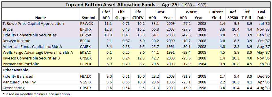
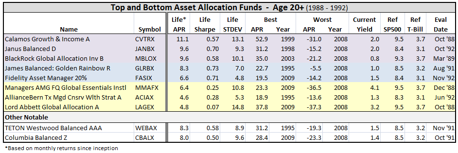
In the tabulation below, purple means the fund was a top performer relative to SP500 over its life time, blue represents highest Sharpe (if not already a top APR), and yellow represents worst performing APR. I included other notables based on David’s commentaries, past puts by catch22, scott, and other folks on MFO, and some funds of my own interest.

Here’s the break-out, by inception date:

1_2012-12-30_0535 2_2012-12-30_0537 3_2012-12-30_0537 4_2012-12-30_0538 5_2012-12-30_0539 6_2012-12-30_0540 7_2012-12-30_0542 8_2012-12-30_0543 9_2012-12-30_0544 10_2012-12-30_0544 11_2012-12-30_0545 12_2012-12-30_0546 13_2012-12-30_0546

Some observations:

  • If you invested $10K in Mairs & Power Balanced MAPOX in Jan 1962, you would have more than $1M today and nearly four times more than if you had invested in American Funds American Balanced ABALX. But ABALX has $56B AUM, while the five star MAPOX has attracted less than $300M.
  • Value Line Income & Growth VALIX does not even warrant coverage by M*.
  • 2008 was a really bad year.
  • Some attractive ETFs have started to emerge in this generally moderate fund type, including iShares Morningstar Multi-Asset Income IYLD.
  • Putnam Capital Spectrum A PVSAX, managed by David Glancy, has outperformed just about everybody in this category since its inception mid 2009.
  • RiverNorth Core Opportunity RNCOX, first reviewed on MFO in June 2011, has had a great run since its inception in 2007. Unfortunately, its availability is now limited.

Next up, fixed income funds.

Fixed Income Funds

A review of fixed income funds, which for this post includes funds that invest in government or corporate bonds, loan stock and non-convertible preferred stock. This type of fund has been getting considerable attention lately on MFO with a growing concern that investors could be lulled into false sense of security.

To recap a little, there are about 1880 funds of this type, of which 30% have actually delivered higher life-time returns than the SP500, and more importantly and relevant, 98% have beaten cash.

In the tabulation below, purple means the fund was a top performer relative to T-Bill over its life time, blue represents highest Sharpe (if not already a top APR), and yellow represents worst performing APR. I included other notables based on David’s profiles, numerous suggestions in the various threads by MFO readers (bee, catch22, claimui, fundalarm, hank, Hiyield007, Investor, johnN, MaxBialystock, MikeM, Mona, msf, Old_Joe, scott, Shostakovich, Skeeter, Ted and others), and some of my own interest.

A reminder that I only used oldest share class, so for popular funds like PONDX, you will find PONAX, similarly MAINX is MINCX, etc.

Here’s the break-out, by fund inception date:

1_2012-12-29_1126 2_2012-12-29_1127 3_2012-12-29_1127 4_2012-12-29_1128 5_2012-12-29_1129 6_2012-12-29_1130 7_2012-12-29_1130 8_2012-12-29_1131 9_2012-12-30_0916 10_2012-12-29_1138 11_2012-12-29_1138 12_2012-12-29_1139 13_2012-12-29_1140

Some observations:

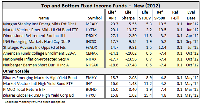
  • Every fund listed (5 years or older) with current yields of 6% or more, lost more than 20% of its value in 2008, except three: PIMCO Income A PONAX, which lost only 6.0%; TCW Total Return Bond I TGLMX, which lost only 6.2% (in 1994); and First Eagle High Yield I FEHIX, which lost 15.8%.
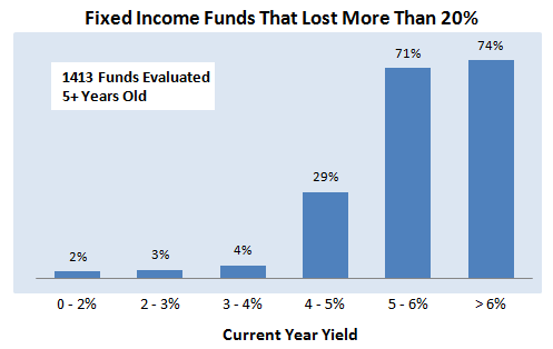
  • In fact, of all fixed income funds more than five years or older that have current yields of 6% or more, nearly 3 out of 4 had a down-year of 20% or more. Those yielding 5% or more did not do much better. For what it’s worth, the break point appears to be between 4 and 5%. Funds with less than 4% current yield did much, much better. Here is summary…

14_2012-12-30_0924

  • Just glance over the list…you will see that PIMCO has produced many top performing fixed income funds.
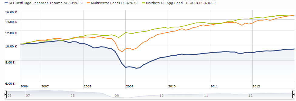
  • Fortunately, again, nearly every fixed income fund existing today has beaten cash over its life time, some 98%. The 44 funds with negative Sharpe actually fall into two distinct categories: First, those with negative Sharpe, but positive life-time APR. These are generally funds with short duration and/or tax exempt funds. Second, those with negative Sharpe and negative life-time APR. There are 25 such funds, but it’s reassuring to find only 3 older than three years old, which presumably means fixed income funds that actually lose money don’t stay around very long. The three enduring poor performers, tabulated below, are: AMF Ultra Short AULTX, SEI Instl Mgd Enhanced Income A SEEAX, and WisdomTree Euro Debt EU.

15_2012-12-31_0911

Both AULTX and EU have less than $10M AUM, but SEEAX is fairly substantial AUM at $170M, which is simply hard to believe…

16_2012-12-31_0916


Money Market Funds

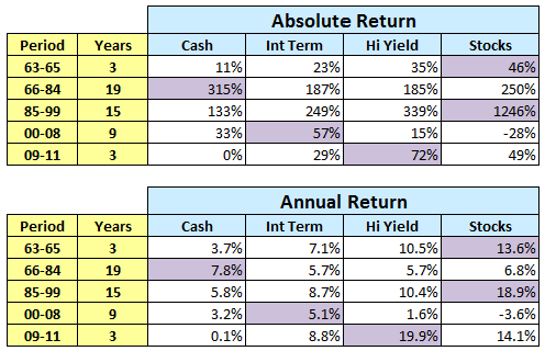
The last part – money market funds, which tend to offer lowest risk, but with attendant lowest return over the long run. There have been times, however, when money market or “cash” has ruled, like from 1966 – 1984 when cash provided a strong 7.8% APR. Here’s a reminder from Bond Fund Performance During Periods of Rising Interest Rates:

1_2012-12-08_1027

Some observations up-front:

  • There are only 500 or so money market funds.
  • The earliest inception date is 1972. It belongs to American Century Capital Presv Investor CPFXX. (But it is not one of better offerings.)
  • Few new money market funds have been created in recent years.
  • Few MFO readers discuss them and none have been profiled. M* does not appear to rate them or provide analyst reports of money market funds.
  • No money market funds have loads, but many impose 12b-1 fees. The average EP is 0.5%.
  • Fortunately, none have a negative absolute return over their life times.
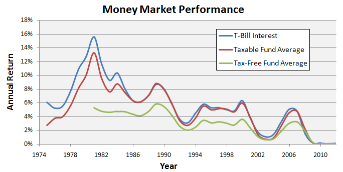
  • There are two main categories of money market funds: taxable and tax-free. The latter have existed since 1981 and represent about a third of offerings today. This plot summarizes average performance for the two types compared to the T-Bill:

2_2013-01-01_1218

  • Since 1981, the annualized return for T-Bill is 5.0%. For money market funds, the average APR is 4.6% for the taxable (about the difference in average EP), and 2.9% for tax-free.
  • Only 1 in 3 taxable money market funds have beaten the T-Bill over their life times. And virtually no tax-free funds have beaten, as you would expect.

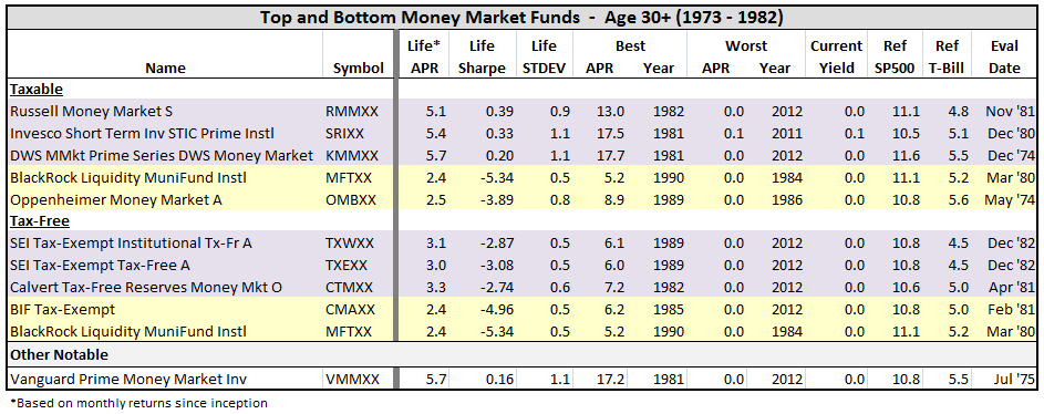
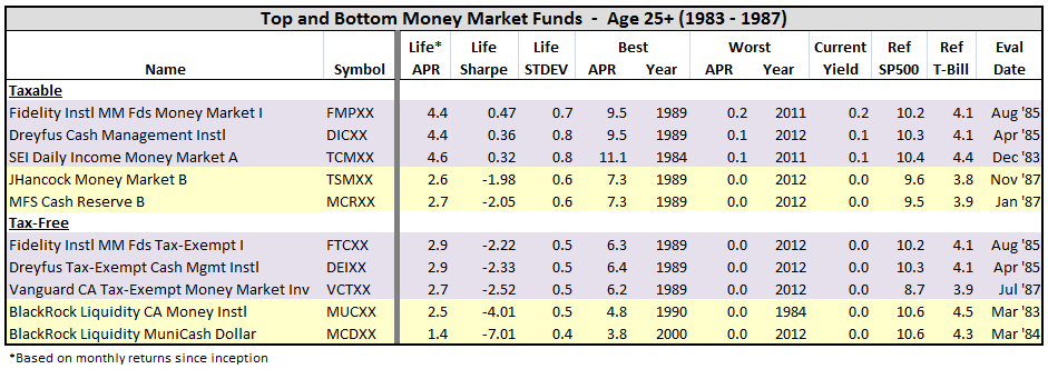
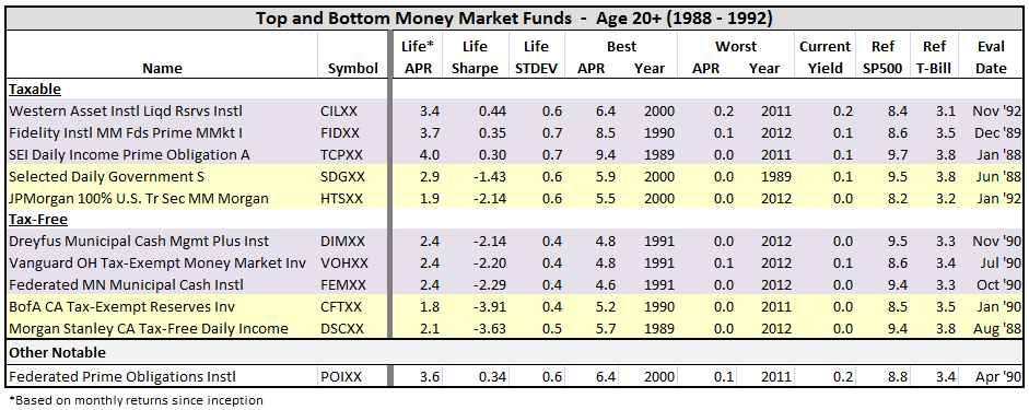
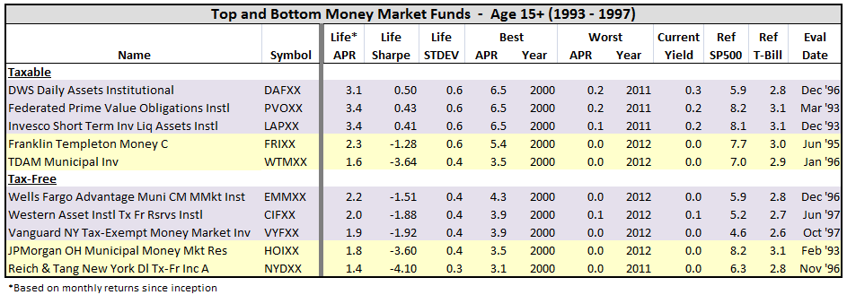
Because of the strong tax dependency with these funds, I broke out this distinction in the tabulation below. Purple means the fund was a top performer relative to T-Bill over its life time, and yellow represents worst performing APR. (For the money market funds, I did not break-out top Sharpe in blue, since APR ranking relative T-Bill is fairly close to Sharpe ranking.)

Here’s the break-out, by fund inception date:

3_2013-01-01_1211 4_2013-01-01_1142 5_2013-01-01_1143 6_2013-01-01_1143 7_2013-01-01_1148 8_2013-01-01_1148 9_2013-01-01_1149 10_2013-01-01_1150 11_2013-01-01_1150 12_2013-01-01_1151 13_2013-01-01_1152 14_2013-01-01_1152

For those interested, I’ve posted results of this thread in an Excel file Funds That Beat The Market – Nov 12.

Here is link to original thread.

Bond Fund Performance During Periods of Rising Interest Rates

By Charles Boccadoro

From the Mutual Fund Observer discussion board, December 2012

Current trend on MFO is discussion of negative impact to bond-heavy income and retirement portfolios, if and when rates rise.

In David’s inaugural column on Amazon money and markets “Trees Do Not Grow To The Sky”, he calls attention to: “If interest rates and inflation move quickly up, the market value of the bonds that you (or your bond fund manager) hold can drop like a rock.” And there have been several recent related posts about an impending “Bond Bubble.”

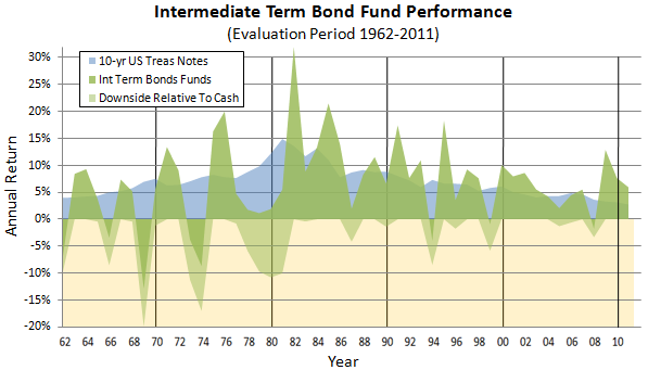
Here’s look back at average intermediate term bond fund performance during the past 50 years:

Intermediate Term Bond Fund Performance

Background uses same 10-year Treasury yield data that David highlights in his guest column. Also plotted is the downside return relative to cash or money-market, since while these funds have held up fairly well on absolute terms, on relative terms the potential for under-performance is quite clear.

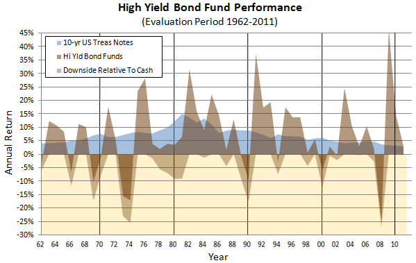
More dramatic downside performance can be seen the higher yield (generally quality less than BB) bond funds, where relative and even absolute losses can be 25%:

High Yield Bond Fund Performance

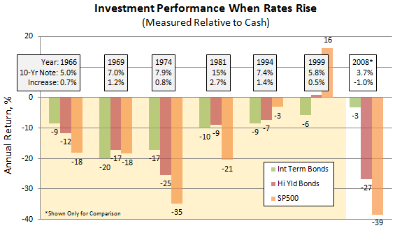
Taking a closer look, the chart below compares performance of intermediate, high-yield, and equities when interest rates rise (note year, 10-year Treasury yield, and rate increase from previous year):

Investment Performance When Rates Rise

I included for comparison 2008 performance. Here declines were not driven by increasing rates, but by the financial crisis, of course. Presumably, such strong relative performance for intermediate bonds in 2008 is what has driven the recent flight to bonds. That said, several previous periods of increasing rates happened during bear markets, like 1974, making alternatives to bonds tough to find.

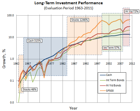
Over the (very) long run, equities out-perform bonds and cash, as is evident below, but may not be practical alternative to bonds for many investors, because of investment horizon, risk-tolerance, dependence on yield, or all the above.

Long Term Investment Performance

What’s so interesting about this look-back are the distinct periods of “ideal” investments, by which I mean an investment vehicle that both outperformed alternatives and did not incur a sharp decline, as summarized in table below:

 Return Table

In the three years from 1963-65, stocks were the choice. But in the 19 years from 1966-84, cash was king. Followed by the extraordinary 15-year bull run for stocks. Ending with the current period, if you will, where bonds have been king: first, intermediate term bonds from 2000-08, but most recently, alluring high yield bonds since 2009.

Despite its flat-line performance since 2009, cash is often mentioned as a viable alternative (eg, Scout Unconstrained Bond Fund SUBFX and Crescent Fund FPACX are now cash heavy). But until I saw its strong and long-lived performance from 1966-84, I had not seriously considered. Certainly, it has offered healthy growth, if not yield, during periods of rising interest rates.

Here is link to original thread.
A Look Back at Dodge & Cox Stock Fund (DODGX)

By Charles Boccadoro

From the Mutual Fund Observer discussion board, November 2012

Several recent posts prompted me to take a closer look at DODGX historical performance. Ted posted the most recent: Dodge & Cox: The San Francisco Treat. Basically, an article from Morningstar defending why D&C has been a top pick for years, based on a strong corporate fiduciary culture and long term record, despite its struggle in 2008 and poor stock selections since, like HPQ, a DODGX heavy for years. hank and Shostakovich made good comments about AUM, definition of value, intrinsic risk management, and debated whether a better approach for a value shop is to be all-in or have some assets in cash at times.

An earlier post: 3 Former Star Funds to Avoid, a stunner by Steve Goldberg, which challenged DODGX exalted status, pointing to “deep flaws in the fund’s stock picking” in 2008 and mediocre performance since. The article took its share of lashings from most, but not all, MFO readers.

I lamented a bit on an earlier related post: Dodge & Cox Balanced Regains Its Stride, Finally? A look back at my decision to buy DODBX over VWELX in 2002. This post includes more recent entries describing HPQ’s 13% plunge on Oct 3. scott weighed in on transient nature of defining value for technology companies. (This week HPQ had another 12% downer-day on suspected fraud disclosure over recent acquisition. Can you believe? This is Hewlett Packard for crying out loud. Good grief.) And fundalarm noted how Dodge & Cox doesn’t appear to “have price targets at which point to book profits or cut losses,” which again brings into question D&C’s risk management philosophy.
OK, stage set. I was very interested in looking at DODGX from a perspective both before and after the real estate collapse in 2008. With David’s assertion that folks are more concerned about loses than gains, and VintageFreaks’ comment about it’s “WHEN you buy, not WHAT you buy,” I looked at worst-case rolling performance, initiated every month over the periods noted, from DODGX’s inception in Feb 65.

The figure below illustrates one reason why everybody was clamoring to own shares in DODGX before 2008. Basically, its worst-case return beat SP500’s worst-case return consistently over just about any period:

1_2012-11-21_0907

Note also that DODGX lost virtually no money for any 8-year or longer period, whereas an unlucky investor in SP500 could still be looking at nearly 20% loss, even after 9 years.

Even longer term, depicted below, DODGX trounced SP500. Basically, the worst period for DODGX was substantially better than the worst period for SP500. 

2_2012-11-21_0918

After 2007, however, an investor could have worse return in near-term with DODGX than with SP500:

3_2012-11-21_0821

But despite this near-term under-performance, an investor with DODGX for periods of about 9 years or more has still never lost money, even periods including 2008, whereas SP500 investors must have invested for periods of 12 years or more to avoid loss.

OK, so that is worst-case DODGX versus worst-case SP500.

Next, I compared DODGX relative to SP500 for same rolling periods. Basically, wanting to see, depending on WHEN, whether it was better to be in DODGX or SP500. So, below are comparisons of DODGX best and worst total returns relative to SP500 for rolling periods dating back to Feb 65 through to present Oct 12:

4_2012-11-21_0930
5_2012-11-21_0931

Clearly, there are periods when DODGX has under-performed the SP500, especially over the short-term. But then its periods of over-performance tend to be more impressive. Over its life, DODGX has bested the SP500 hands-down.

Taking a closer look at WHEN, data from above two charts are tabulated below, along with ending month/year of the corresponding best and worst periods. At a glance, most of the best over-performance were during periods leading up to the real estate bubble in 2008, while most of the worst under-performance actually occurred in the years leading up the tech bubble in 2000.

6_2012-11-22_0600

Going still further, the chart below shows growth comparison from DODGX inception through 1987 market crash. Basically, for first 20 plus years of DODGX existence, it beat SP500 handsomely overall. Perhaps more important is that DODGX performed comparable to the market, within 2-4%, during the five or so significant down-markets during this time.

7_2012-12-02_1315

Then, during the next 20 years, shown below, DODGX had its most extraordinary performance, which surely helped establish the many recommendations for DODGX, by M*, Kiplinger, and others.

8_2012-12-02_1320

Leading up to late ’90s, DODGX actually lagged the SP500 somewhat; in fact, that’s where its worst total returns relative to SP500 actually occurred. But when the tech bubble popped in 2000, DODGX sailed-on through. While the SP500 lost 45% in the down-market from Sep 00 through Sep 02, DODGX lost nothing. In the five years after the bubble, it continued to handsomely beat the SP500. No doubt, DODGX’s stellar reputation was born during this extraordinary period of performance. Everybody clamored to get in, AUM grew, and the fund closed. It had become the perfect equity fund, avoiding down-side losses, while over-performing in up-markets. Until, of course, 2007. The funny thing here is that DODGX lost only 9% more than the SP500 during the great recession, but its reputation–that of being the perfect equity fund–was tarnished, if not shattered.

Just a few more comparisons, and I will stop, promise.

The tabulation below shows a “batting average,” basically number of times DODGX beat SP500 in rolling periods considered since Feb 65. On any given year, it has beaten SP500 more than 50% of time. More than 60% in any 2-year period. More than 70% any 7-year period. More than 80% in any 10-year period.

The tabulation also shows the number of these periods that DODGX and SP500 have lost money. Since Feb 1965, SP500 has never lost money over any 12 year period or longer. DODGX has never lost money over any 10-year period. A closer look shows that it only lost 2% in its worst case 9-year period. In fact, there were only two 8-year periods out of 478 considered that DODGX lost money: the period ending Feb 09 when its total return was -13.2% and Mar 09 when it was -4.2%.
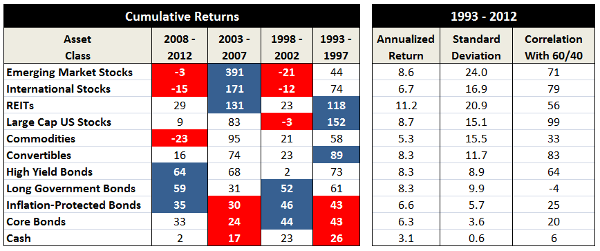
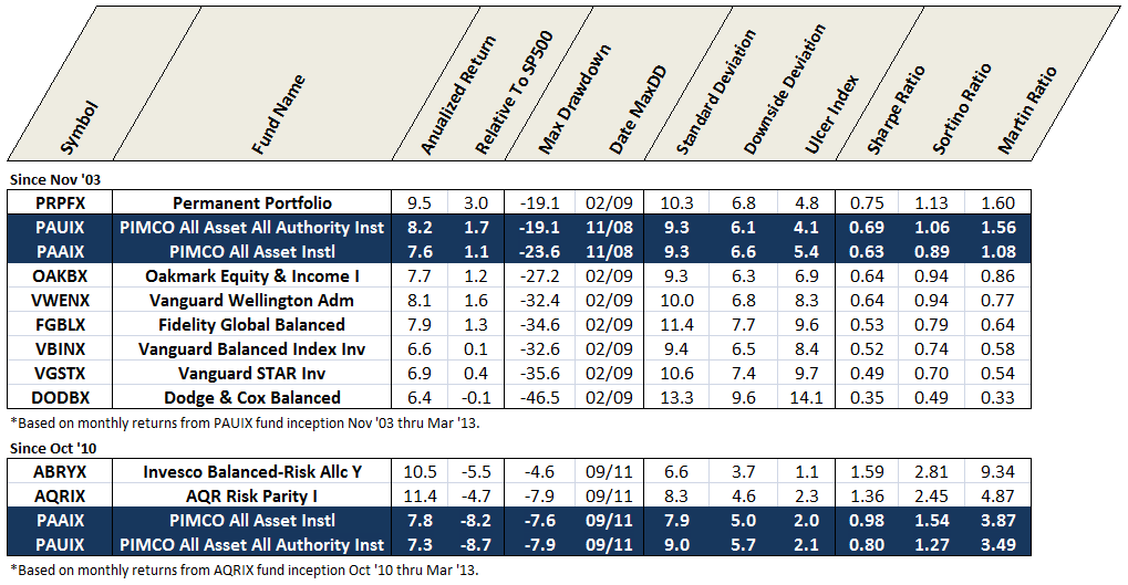
9_2012-11-22_0701

Here is link to original thread.